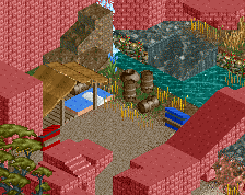
Screenshot / Yukumo Village
-
 12-April 17
-
 Monster Hunter Design Series
-

 4 of 4
- Views 1,906
- Fans 0
- Comments 6
-
 Description
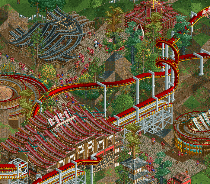
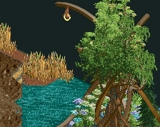
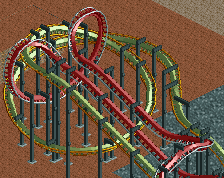
with all the high quality, NEDC4 screenshots posted lately I decided to contribute something that is neither
I started this as an entry to the reddit march contest, life happened and I never had a chance to finish in time but I'm still slowly working on finishing it for a design submission -
 Full-Size
-
 No fans of this screenshot
-
 Tags
Tags

Looks nice, I think you'd be suited to LL with the amount of well done trackitecture.
Oooh I love me some good ncso like this, albeit everyone does Asian trackitecture, it'd be nice to some shakeups
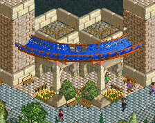
I like the overall composition. The archy needs some work though - some of the buildings are literally just trackitecture. I'd suggest putting more care into the walls. The station for instance is weird in that it has a row of banners suggesting an open structure with then a row of windowed walls above. Then you have an awkward overlap on top of that. I'd try and simplify things a bit. Start with just 1 basic wall perhaps and add trims, a base, poles on the edges, windows etc.
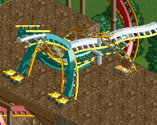
I also think the brake run going over the path is a missed opportunity for a wall/gateway/bridge of some sort - instead you just have white box supports.
@louis I am working on my first post-NEO LL project, it's just coming very slowly
@togorandu I know Asian roofs are easymode lol but this won't be the only trackitecture you se from me!
@alex good points. I'm not sure how I feel about the bottom right house or the top right either, those will most likely go. I'll also look into the station and brake run, I'm sure I can come up with something cool there. Thanks
Does this look any better? The arch isn't perfect but I think it all looks kinda cool
I like it, nice work here. Definitely an interesting style so far.