Screenshot / Montanhoso - Intamin Blitz (WIP)
-
 31-March 17
-
 Project I: Unnamed
-

 2 of 6
- Views 1,909
- Fans 0
- Comments 5
-
 Description
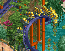
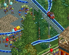
Here's an intamin blitz I've been working on slowly for the past few weeks in my 'solo' project. Currently, it's still WIP, but I thought I'd show you the mostly completed best part.
More to come is the supports, and a few more little details, as well as the surroundings -
 Full-Size
-
 No fans of this screenshot
-
 Tags
Tags
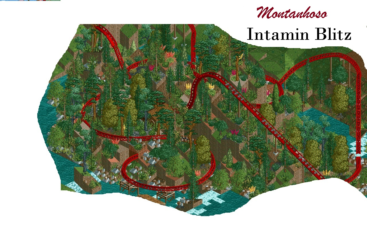
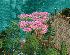
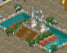
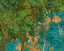
The foilage is bonkers. It's literally all over the world. But I still really like it! It looks good, so that's what matters in my opinion. Don't like the 'rocks' by the shoreline very much though. Looks too uniform, which takes away the natural look.
Looks good, perhaps a bit messy but I think it works well.
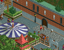
But I agree with Angroc, perhaps try to make the 1k ruins a bit more natural looking but using the quarter tile objects rather than the full tile clump.
Is there anything else you all think could stay/be improeved?