Screenshot / Snaps @justinhansCA - Blue Oak Amusement Park
-
 26-March 17
-
 Blue Oak Amusement Park
-

 8 of 13
- Views 2,709
- Fans 0
- Comments 8
-
 Description
"Justin Hans, one of our esteemed Ride Operators at Blue Oak Amusement Park has posted some great snaps of the park when he's free. We saved them because we love our employees, but also because we knew you'd love them too! ~Vacation Classy at Blue Oak~"
-
 Full-Size
-
 No fans of this screenshot
-
 Tags
Tags
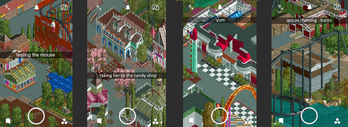
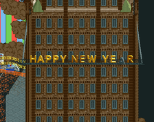

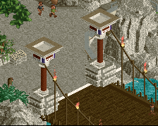
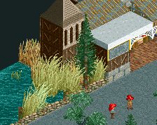
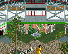
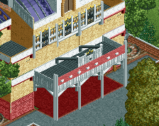
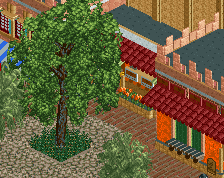
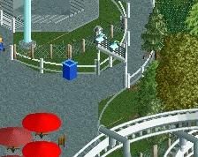
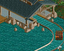
This is actually a pretty cool way to advertise. Nice shogo
Third screen is indeed very yummy. Great job.
It takes a lot of patience to wait for your release, but it's all worth it, because you're quite exceptional at this.
I don't say this often but... Niceeeeeeeeeeeeeeee!!
Notice the amount of e's.
Now go work on it, enjoy it, build it and finish it! This is amazing work.
Otsdarva Offline
Great stuff especially that diner. The use of the candy theme objects is quite genius like the jelly as concession stand prop and the candy canes as arches.
Absolutly in love with the second screen.
We'll talk more about this in private, but I'll go screen by screen and address things:
1.) Love the game stand, good colors everywhere, just needs some life (probably will look better with peeps in there)
2.) The candy shop is my second favorite building in the whole park. Excellent architecture and colors, we need more of this.
3.) The diner is my favorite building in the park. Pure perfection. Also, why'd you change the Intamin's colors? I liked the yellow and pink.
4.) Foliage needs some work, and I'm not convinced black on black is the best choice for the invert.
I like the presentation! Second screen is the best. First screen is messy.