Screenshot / Superhornet and Friends
-
 19-March 17
-
 Essex Naval Park / Warbird Cove Amusement Park
-

 4 of 8
- Views 3,430
- Fans 0
- Comments 22
-
 Description
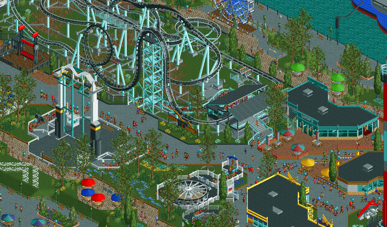
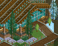
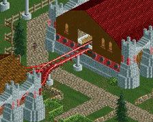
Warbird Cove is a relatively small amusement park that was situated on the pier next to the USS Essex museum. The hope was that the park would draw attention to the exhibits, and it certainly did.
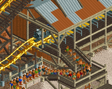
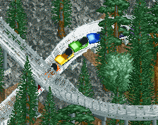
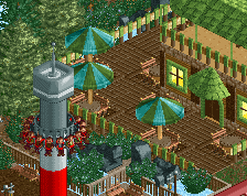
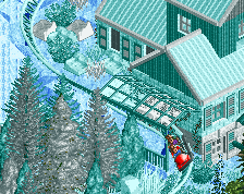
Featured here is Superhornet, one of the park's newest additions that replaced an old picnic area. It is a custom Gerstlauer Euro-Fighter (a la Rock Bottom Plunge), and is one of the most popular rides in the park despite its low capacity.
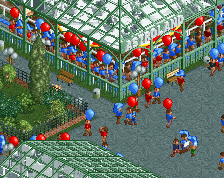
Also seen here are some of the park's various flat rides including Corsair, an S&S Screamin' Swing that is also a major hit with the guests.
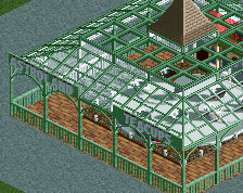
This part of the park also features ample seating and shopping in a pleasant setting that was once an old naval pier. -
 Full-Size
-
 No fans of this screenshot
-
 Tags
Tags
Umbrellas look 1 unit to small. Foliage could use some work. But I like the rest, 75%
the umberellas look fine to me, but I agree, foliage could be better but I know that's not your strong point
Anyway, I love the liveliness of the screen! Only thing that kills it for me is the repetitiveness of the foliage, but some different trees would do the trick I think.
Very well done! I don't understand the umbrella problem neither, they look fine!
I agree that the foliage could be better but it still looks credible and nice. One of my only complain is the color of the coaster, there is too much white/grey/black in the area, more exotic colors would have fit better in my opinion but maybe you're heading for something sober. There is so much passion put into this! 85% for me!
I agree. There is also a lot of teal in this screen. It looks really nice on that restaurant, for the coaster maybe try yellow/black instead, would also fit the name better.
That's a really good idea, actually. I'll give yellow a shot for the supports.
Pretty rad. That whole walkway by the water is really nice.
I also feel like there is a lot of black in this screen which is making it very dark and loses a lot of atmosphere. Not just with the coaster colors but you have black curbs, black on the flat rides, the flat ride platforms, the roofing. Changing the coaster may help, but I think you could even change the other things I mentioned as well. I feel like a different path type would even help but I could see why you'd want to keep the tarmac.
Overall though this is skillful technically. Keep it going! The layout looks pretty sick.
Great job though, keep it up, you know I think highly of you.
Experimenting with some lighter shades to the coaster features and some tree variety. Thanks for the comments, everyone!
Coaster colors are probably the only real issue here, at even then its only the large amount of black. Same goes for the S&S, try and experiment a bit more. Very promising though!
I think the colours are great here. They fit the idea behind the map somehow and they make the park stand out from all the other realistic parks out there. It's a part of the park's identity for me. I agree that the colours could be managed a bit better. For example there is no excuse for having a black curb and then across the same path brown curbs. Go with all brown. I think the white fences around the enterprise pop nicely. Use the same white fences around the other flat. And the top spin too. I know I always make a big fuzz about fences, but I swear that having a clear and consistent fence scheme can do wonders in any park. Fences might just be the most underrated and overlooked aspect of parkmaking.
I don't have an issue with the black if its counteracted by other contrasting elements; however, it isn't. Simplifying your fences like what Liam suggested and better contouring path layouts especially around the S&S would do wonders (also please widen that 1-path bottleneck as well).
Going specific into the fencing, I dont like any of the choices you've presented in this screen. Either color for the curbs doesn't work well. The post fencing looks out of place and out of theme too. I do like the short wall separating the restaurant from the main path though.
70%
What a glorious work you've done so far Arctic! It all looks pitch perfect other than the repetitive foliage. I'd suggest adding a 1-2 tall trees and 1-2 smaller ones.
What you have got here stands to beg me to differ on colouring issues. While I do agree black and yellow would be better, what Arctic has now simply has a charm to it. I'm not sure what that is either.
Anyways, this is a mega creation and I am really excited to see the end product!
I love all the fence work, especially around the flat rides, makes them really stand out.
I love the fact that you don't use wide paths all the way around the park, all parks, particularly the one you are going for, feature smaller paths, I love that there isn't a see of concrete.
I think the path layout is fantastic.
I think my issue with the colours, wasn't that they didn't feel right, I just feel that maybe the grey rails are what's off about them, they are likeable but at the same time dislikeable lol
Yeah, this is real nice CC9. Quality work. Listen to Steve about foliage.
Nice screen. Not keen on the coaster colors too. And I'd use some different kind of trees instead of the same one over and over Keep it up, promising work!