Screenshot / Wild One
-
 19-March 17
-
 Eastwinds
-

 2 of 2
- Views 6,486
- Fans 1
- Comments 47
-
 Description
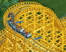
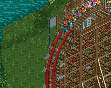
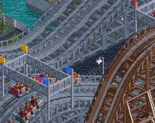
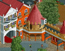
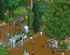
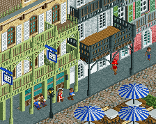
Wild One was originally designed and built by John Miller in the 1926 at Lincoln Park in Pennsylvania. When Lincoln Park was nearing its end in the mid 80s, the ride was sold and re-located, then re-constructed by Dinn Corp for the 1987 season. Upon its original opening, it was one of the tallest roller coasters in the world with a height 96ft, and one of the fastest with a 56mph top speed. Now over 90 years old, Wild One is still thrilling riders despite numerous modifications and changes in scenery over the years.
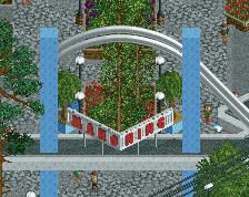
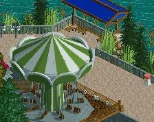
Also featured is Voodoo, a 2nd generation Intamin freefall built in 1998, along with Flying Carousel a Zamperla Swinger added in 1997. -
 Full-Size
-
1 fan
 Fans of this screenshot
-
 Tags
Tags
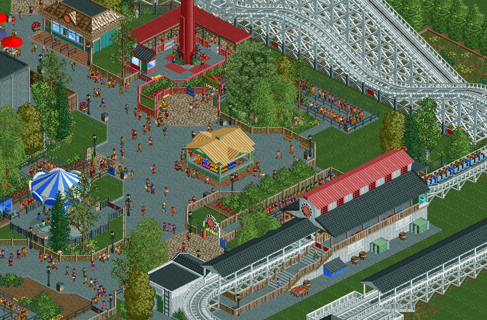
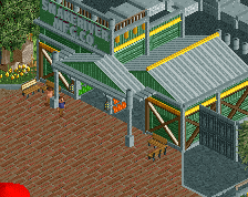
I'm not offended by the fences. It's the tan roof that is giving me a headache. One of the poorest colours you could've chosen. That whole kiosk doesn't rhyme with anything else in the screen anyway, maybe get rid of it altogether.
I agree with the other commenters mostly, it's very solid and underwhelming. I'll say this though, you perfected the art of making paths seem cozy and pleasant on the eyes. I also noticed that in your design. Through a nice irregular path layout you can get quite an atmosphere going without adding many features. This screen should be shown to newer players who keep making boring linear paths and grid layouts.
I read this as 'keep mowing!'. I don't think any of your parks have a single tile of grass unmowed. If you were to create a prehistoric landscape in RCT, I reckon you would still mow all the grass.
I'm amazed how people are seriously complaining about the relative fence height. I guess that's what happens if you're so anal about realism and "correctness".
The screen is nice, you know what you're doing sure, but it's also really just cold and loveless.
I'd say I'm one of the lesser 'anal' members here when it comes to realism, but if you're building in a realism setting then I think everything has to work on the same level. Here, whether it's due to their height or anything else, I don't think the fences are working as well as what they could if they were swapped for something else.
The term suspension of disbelief or willing suspension of disbelief has been defined as a willingness to suspend one's critical faculties and believe the unbelievable; sacrifice of realism and logic for the sake of enjoyment.
https://en.wikipedia...on_of_disbelief
also, why do fences necessarily have to be shorter than people? i, at least, am interpreting those as a fence like this:
I'm excited for that woodie. Sock it to me, baby
No one has ever complained about the fences being that high before, they are literally that high in almost every single RCT park in existence.
I love it, and the fences are fine.
Thanks, I guess...
If someone could make better peeps, that would be great.
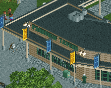
I've gone and changed the colors of the building in the middle, this was slightly based off of the area around Wild One at SFA, but obviously it looks both horrendous IRL and therefor translates to horrendous in game.
When it comes to "spacing", well yea, I get ya here. This area is definitely a bit compact for my usual liking, and kind of concerns me going forward, but at the same time it would require heavy modifications to improve so I don't really know if I'll change it. Besides, I'm happy enough with how it looks from the other angles so in the end its not a massive problem. Not only that, but I feel that maybe 10% of people actually notice things like this, so eh, probably not a huge deal in the end, despite it bothering me a bit.
I'll see if I can find a better alternative for the red windows on the station as well, perhaps something a bit less bulky.
Louis did kind of hit a point with his post, most of this was built after I didn't play RCT for like 2 months over the holidays, so I guess I was a bit rusty. Though at the same time I'm going for a bit of a simplified style and not really trying to make the greatest park of all time, which is probably pretty obvious. Just building things from real life parks that I like, rather than optimal content for maximum NE accolade scores.
As for the "theming", I want to portray the nature of many parks to lessen their theming efforts as the parks expand. So while the entrance and inner areas of the park will have some moderate colonial, and possibly western theming, the outer edges of the park will not, in order to sort of portray park expansions over time. Hopefully it will come off better in game when you'll be able to see the full park.
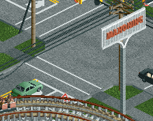
It just bugs me that it has this really clean feel to it, the grass is mowed perfectly, the paths are perfectly made, road lines are separating different path types creating more organisation, it just feels really organised and ordered and clean and tidy, but its trying to be an amusement park, which, for me, is the total opposite.
That's what I dislike about your work, its too clean, too prim and proper, you say you've gone for a simplified style, and that's great, but it doesn't feel like it, because its just as tidy and neat as your other work, albeit, like you said, a bit rusty.
I like it though, you are doing what you want to do, how you want to do it, and I like that you aren't trying to push boundaries and try and build for maximum score.
Oh yes, forgot to mention the grass, I'll definitely work in some other patters or include some non-mowed spaces.
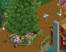
I actually believe I've developed an allergic reaction to open grass tiles in my own work, hence the grass objects going a little bit out of control here.
Road lines are another point I've debated with myself a bit, perhaps I'll remove them all together or attempt to strategically remove them to portray the older/messier areas. However, a part of me feels that if its not either or, it just feels bad and non-cohesive, much like the mowed grass object vs. open tiles.
There is definitely some fine tuning that needs to be done, but like some were suggesting, I'm not going to completely re-approach the park with heavy theming and ten millions colors in mind. Most of the content is going to stay, such as the grey path types, fences, and general archy style and forms, no matter how "boring" it may be to some.
Oh I love that 'boring' style that everyone hates, it was just those points I made that I had issues with, and always have done with your work lol, keep making boring shit, it's what I enjoy, it's what feels 'real' to me.
I do understand that, I prefer the mowed stripe grass too But isn't it quite a waste of object space? You could easily plop a few handymen mowing grass. Or use the function in OpenRCT.
I see what Louis is saying stylistically, but again that's more about RCT "philosophy" (see a robbie thread back in ~2011 about masculine/feminine realistic parkmaking styles) that what you can really criticize Russ on.
Also about the fence nitpicking (which is why I shitposted what I did.... this screen's comments is worse than coasterbill/JDP/CP6 all collectively, at the same time, seeing a screen with a 9-car B&M Invert).... It's more of the peeps being incorrectly scaled than the scenery. The average height of peeps seems to be under 5' in-game.
Onto the screen, it's a little safe especially where architecture and the lack of a "popping element" resides. Again though, the subtleties you've done with not only the foliage but the unconventional path layout had given it some, but not all, soul it needed. You have possibly the cleanest style I have seen of any recent parkmaker and that might be to a fault.
80%
I like this screen. Yes, it is very similar to your previous works, but it's still a good screen. Maybe some colorful flowers around the swing would give this screen a little bit more life, but overall this is some really good realism. I even like the tan kiosk roof Liampie was complaining about. If only you could finally stop using the big oak tree. You have the big Liam tree now which looks very alike, but with correct shading.
Wouldn't be a G Force screen without 30 fucking comments hahaha. It's nice, it's pleasant, it's good solid work.
Would be cool to see you adopt some of Louis' suggestions and maybe explore more of the roughness you had in the abandoned recreation project, might also address all the "everything is the same" comments you seem to keep getting. Personally, I don't really care. I just want to see archy with more than one floor lol
This. Stop stealing all the comments G Force!
Also: yes to roughness and yes to more than one floor!