Screenshot / Wild One
-
 19-March 17
-
 Eastwinds
-

 2 of 2
- Views 5,710
- Fans 1
- Comments 47
-
 Description
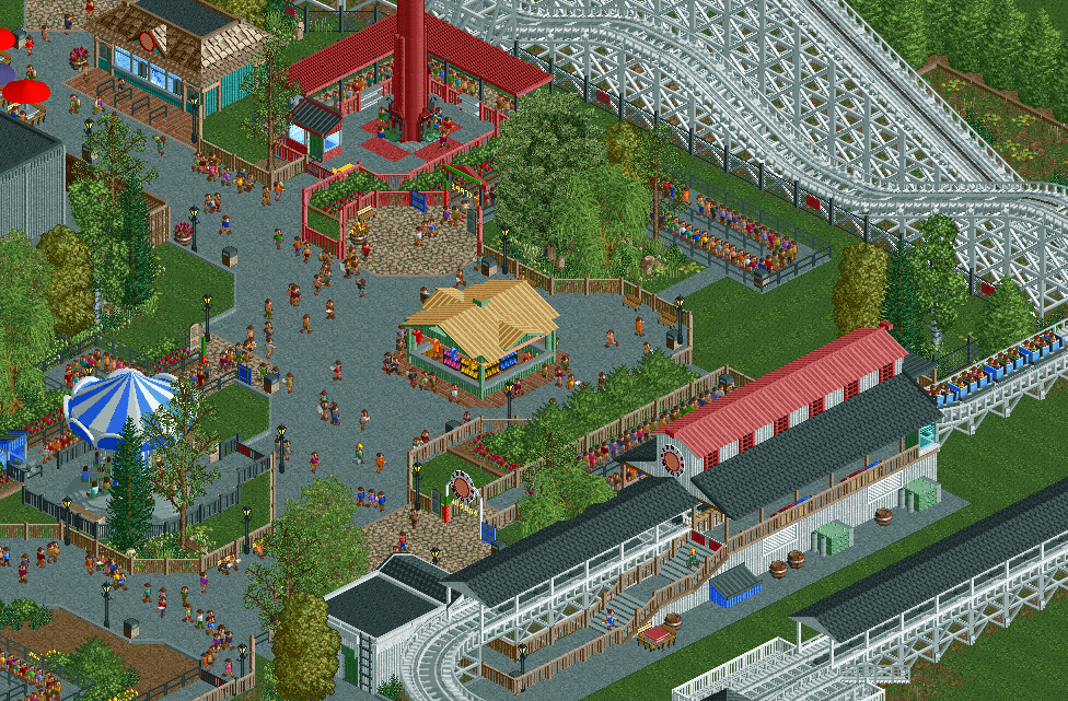
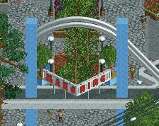
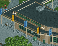
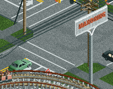
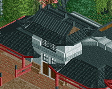
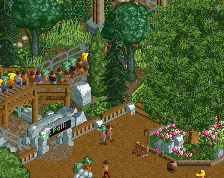
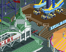
Wild One was originally designed and built by John Miller in the 1926 at Lincoln Park in Pennsylvania. When Lincoln Park was nearing its end in the mid 80s, the ride was sold and re-located, then re-constructed by Dinn Corp for the 1987 season. Upon its original opening, it was one of the tallest roller coasters in the world with a height 96ft, and one of the fastest with a 56mph top speed. Now over 90 years old, Wild One is still thrilling riders despite numerous modifications and changes in scenery over the years.
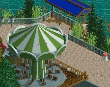
Also featured is Voodoo, a 2nd generation Intamin freefall built in 1998, along with Flying Carousel a Zamperla Swinger added in 1997. -
 Full-Size
-
1 fan
 Fans of this screenshot
-
 Tags
Tags

So Eastwinds is a thing now? Well, there goes one of my favorite jokes about NE's realism.
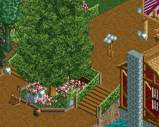
Good looking screen, all very clean and well done. Might be a bit bare though. Quite a few empty patches. Maybe fill those around the swinger up with some flowers and platers instead of path?
Clean. I follow Jappy, I think a bunch of flowers and plants around the swinging would make it more atmospherical.
I feel like my main issue here is the scale of things in comparison to the size of the peeps.
Every fence is as tall, if not taller than the peeps. The counter on the game booth is almost as tall as the peeps.
I think changing the fence could help, but it could just be in this screen due to the large amount of fencing.
Other than that, it's a good screen, but there's nothing to really take it to the next level.
tbh, I find this screen quite boring. This screen lacks an eye-catcher. Currently this screen seems focused on the brown-roofed shop in the middle. The Wild One station isn't interesting-looking enough to draw my attention, nor is the freefall.
Likely as much a problem with framing as with the content, though.
This, especially the fences really kill the screen for me.
I don't think he tried to do something "next level", for me this is just a nice recreation. While I agree that there's nothing really eye catching, this is still really well done and with good taste. Maybe it would be better to show directly the finished park than a screenshot, the atmosphere would be more palpable.
PS: no fence problem for me
(as always sorry for bad english ♥)
This actually looks worse and is somehow even more boring than Westwinds.
it's really unexciting, and seems like a step back from World's of Fun. It's clean and everything, but maybe too clean, and doesn't have the well spaced out look of your other work. It might just be me, but I'd rather see the in-game mowed grass too.
"Nice" is the best way to describe this for me, but not in a good way. The atmosphere is practically nonexistent, everything is so picture perfect and well executed but so extremely bland at the same time.
I guess if you're trying for a realistic recreation, and the real-life counterpart is actually this bland, then in that sense you've succeeded. Otherwise, I wonder, "why bother?".
I think this sets out what it's trying to accomplish quite well. You've really taken me to a typical American amusement park here, and everything is executed cleanly and is quite pleasing to look at. I particularly LOVE the foliage here; it's subtle and engaging without being too overpowering. My only complaint is that I don't particularly like the red windows of the station, but that's my issue with the object more than anything objective.
Pretty Nice! I hope you can build more cedar fair parks with different wooden coasters like custom coasters international, gravity group, john c allen, & dinn corporation, not just gci's but no offense!
Again, not bad stuff. It's all very well done. The coaster hills look great and I like how cleanly everything is done. Keep moving!
The wooden in the screenshot isn't even a GCI...
Overall, seems like you've accomplished what you're going for. The queue cover on the drop tower is bothering me a bit for some reason, but other than that I pretty much agree with what has been said already.
Yes I agree no gci's no offense!
According to all known laws of parkmaking, there is no way that a peep should be able to be shorter than the fence. Its pixels are too small to get its fat little body over the fence. The peep, of course, tries anyways. Because peeps don't care what rct players think is impossible
Lovely screen Russ, I do miss the roughness though, The cracked pathing etc.
Good stuff though, just needs that little bit extra to make it stand out, feels a bit raw and as if you've had a break from rct and are coming back again.
Personally I know G-Force prefers this style of park making, and I'd rather see him keep building something he enjoys rather than stopping altogether. You do your thing, and I'll do my thing,... no way I'm doing a realism park! I agree it needs a touch more pizzazz as has been covered by other comments, but otherwise a nice screen. And I think the fence issue is just the nature of the game, how it was created... even the 1 unit high fence is often too tall compared to the peeps, they're pretty short people. I kind of imagine they're all like 8-10 years old.
make the fences higher