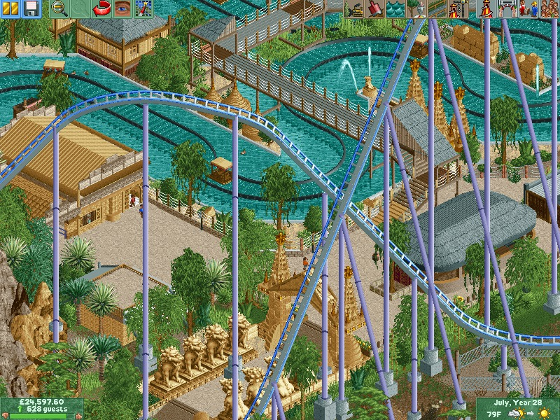
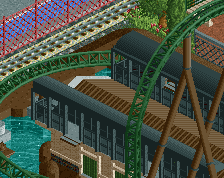
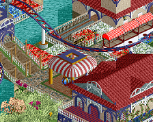
Kind of like the other screen, the colors are a bit dull. Especially the coaster, which should be vibrant and stand out. Perhaps change the purple to the brighter shade and maybe use the dark blue or aqua for the rails.
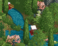
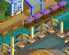
I love all the colours. They're nice and subtle, not pretentious. This is actually looking close to incredible. Your "own style" factor is stronger than what we usually see. Looking forward to more.
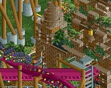
Some of this feels very basic, and that hill is so ugly, why is the gentle slope at the top there? Put it at the bottom so its not so goddamn ugly, that's just basic coaster building.
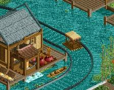
Nice though, the structure are good, if not boring with everything being so tan.
 12-March 17
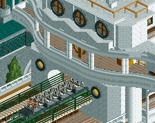
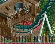
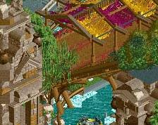
it is the second hill, gonna be sizeable!
I love your style and scale, but you're clearly refining your work quite a bit which is awesome to see.
Kind of like the other screen, the colors are a bit dull. Especially the coaster, which should be vibrant and stand out. Perhaps change the purple to the brighter shade and maybe use the dark blue or aqua for the rails.
I love all the colours. They're nice and subtle, not pretentious. This is actually looking close to incredible. Your "own style" factor is stronger than what we usually see. Looking forward to more.
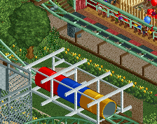
Great! Can't wait to download it and have a better look at it.
Some of this feels very basic, and that hill is so ugly, why is the gentle slope at the top there? Put it at the bottom so its not so goddamn ugly, that's just basic coaster building.
Nice though, the structure are good, if not boring with everything being so tan.