Screenshot / Angkor (part 1)
-
 12-March 17
-
 Shambala
-

 18 of 23
- Views 1,316
- Fans 0
- Comments 5
-
 Description
Hey peeps
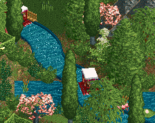
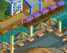
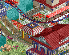
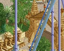
I've had exams recently so not much rct2 but I passed! So back on the crack. I have now more or less finished angkor and the final touches to shambhala. I have the imperial theatre and a few finishing touches and then I'm ready to publish. If I have data room I might squeeze in the silver river flume.
Almost there -
 Full-Size
-
 No fans of this screenshot
-
 Tags
Tags
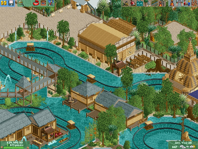
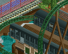
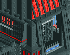
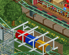
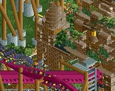
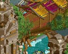
Congrats on passing your exams. Screen is looking good, and the other one as well. Marvelous colours! The foliage is not very good I think. Either the tree mix doesn't work, or it's bushing sitting awkwardly on the sand. Still, good work! Can't believe you're thinking about hitting the data limit on this one.
Too much grey I feel, there are probably better options. Try and experiment a bit, just kind of feels dull right now.
I agree about the roof color, but otherwise this is beautiful. Very neat. 85% for me!