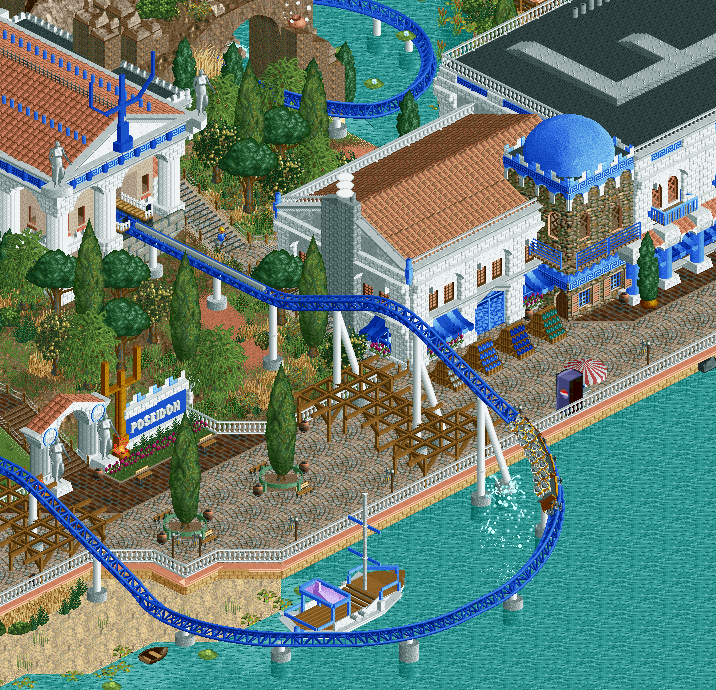
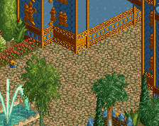
The assymmetry of the station building is a little disturbing, considering it's a huge faux pas in terms of classical architecture. On the other hand, this is a themepark so whatever. Everything else looks really nice, definitely some of your best work like Shotguns says, and also curiously retro somehow.
I don't mind the turnaround at all to be honest. Kinda like it. I think the boat object is a bigger "offender". I think it's being overused. Build your own boat instead! I would change the colour of the glass doors to turquoise, and add some "happier" colours to those shelfs with maps in them.
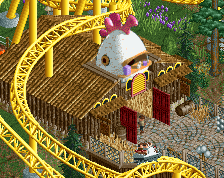
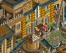
I think this could be your best work. I think it will be even better when you add peeps.
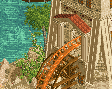
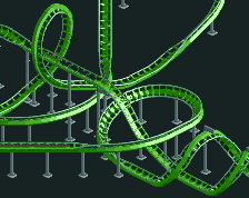
i would smooth out the banking as it ascends in the bottom left. just switch out some of the straight track for some banked track and i think it will look much more smooth
-build your own boat
-Ditch the vending machine
-Maybe ditch the poles on station roof? I don't understand them.
-Maybe some vines/foliage on the pergola.
 10-March 17
actually some of your best work.
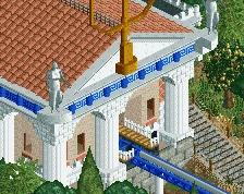
Really great, dude! I love the textures. Maybe a bit too much blue, but that might always be a problem when doing a greek theme haha
This looks really good.
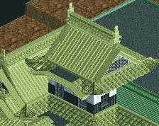
Thumbs up!! Though I wish you'd have kept the shingle roof for the rightmost building too, instead of the "flat-n-some-ducts" roof.
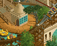
I love the reverse Furious Baco vibe you have here.
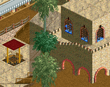
the vending machine looks out of place but everything else fits well. Nice Blue.
The assymmetry of the station building is a little disturbing, considering it's a huge faux pas in terms of classical architecture. On the other hand, this is a themepark so whatever. Everything else looks really nice, definitely some of your best work like Shotguns says, and also curiously retro somehow.
Yeeeeeah totally !
To be honest I'm loving everything from this screen and Furius Baco is my favorite roller coaster so I rated this screen 100%. Thank you.
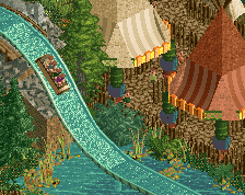
I really like everything about this but the covering over the paths. I get why its neccesary its just not aesthetically pleasing to me.
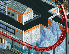
No-one is going to comment on how ugly that turnaround is, or is it just me? Rest is nice, loving the trident symbolism.
Great screen! You're making stunning progress!
I don't mind the turnaround at all to be honest. Kinda like it. I think the boat object is a bigger "offender". I think it's being overused. Build your own boat instead! I would change the colour of the glass doors to turquoise, and add some "happier" colours to those shelfs with maps in them.
I think this could be your best work. I think it will be even better when you add peeps.
i would smooth out the banking as it ascends in the bottom left. just switch out some of the straight track for some banked track and i think it will look much more smooth
-Ditch the vending machine
-Maybe ditch the poles on station roof? I don't understand them.
-Maybe some vines/foliage on the pergola.
Really good screen.
Great feedback guys, I'll use it for sure! I only used that boat in order to save objects but it is not really needed over there I guess.
beautiful fred
never do that