Screenshot / Little Italy
-
 10-March 17
- Views 2,294
- Fans 3
- Comments 16
-
 Description
Hello again!
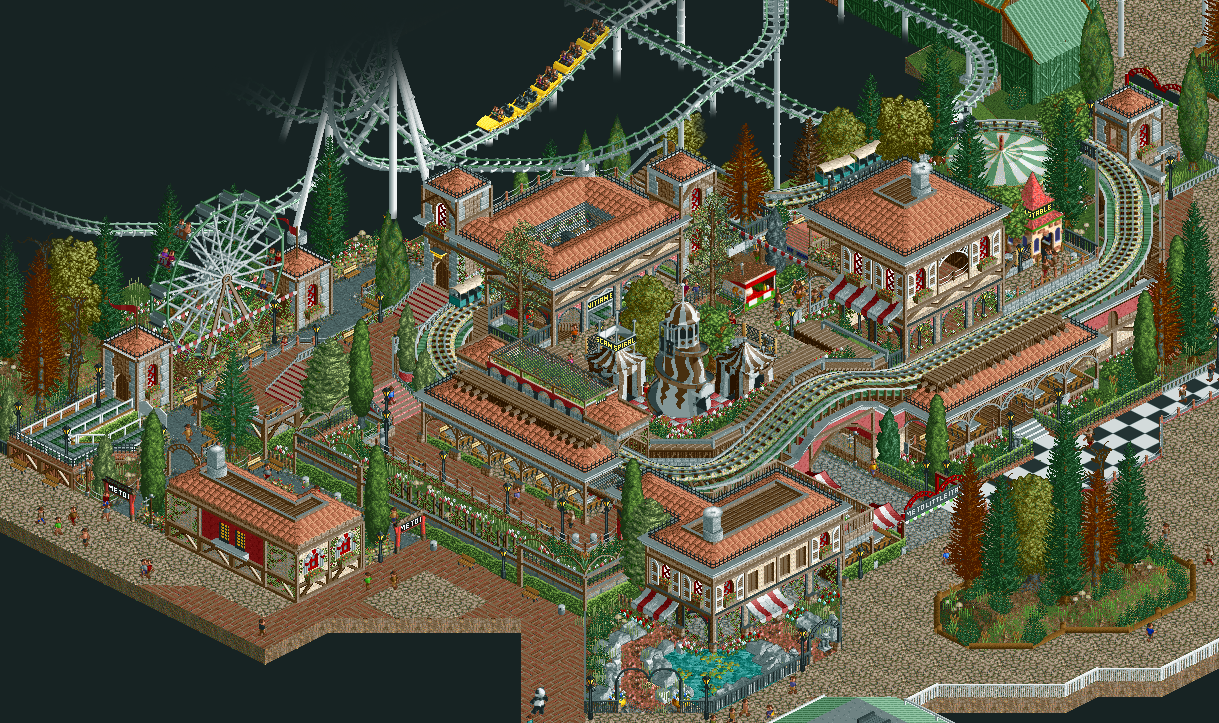
The name may be a bit confusing as it hardly looks anything out of Italy, but I'm not good with names as such. I should look at actual Italian architecture for once to maybe make things actually accurate.
Cropped the screenshot accordingly to isolate the actual work. Roller coaster in the back not part of the screenshot, though if anyone is interested, it's not mine.
Currently on Tycoon Paradise Server 1 (as of 10 March 2017).
I suppose I should credit Julow for giving me a style to take inspiration from. Thanks, man!
Link to other three angles in the comments section. -
 Full-Size
-
3 fans
 Fans of this screenshot
-
 Tags
Tags
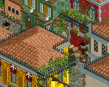
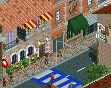
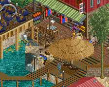
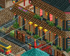
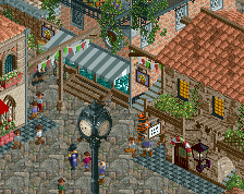
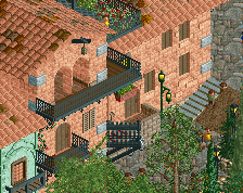
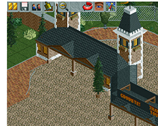
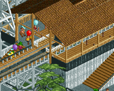
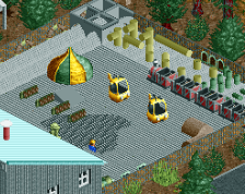
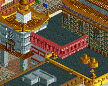
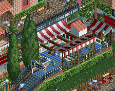
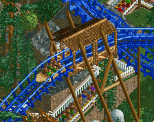
Other three angles:
Looks really, really good, this. Very densely layered but it works. The only thing I don't like are the brown spruces. I'd love to see more of the coaster, I always appreciate a nice old-school Arrow!
Love the little train ride. That bridge is so good. Reminds me of model trains
You definitely have a lot of skill, it just needs cleaning up a bit e.g messy paths, those brown trees, the carousel ride huts etc.
Lovely atmosphere. The buildings are still a bit blocky, I think. The flowers would add more to the area if you give them a brighter color. And the brown spruces need their original color for sure, like mintliqueur already mentioned. I love the composition of the area.
Very atmospheric indeed, but it's also a bit difficult to see what's going on. Poke is right.
Very nice!
I really wanna say I appreciate the honest criticism everyone gives around this place
Thanks to those that really like it, and really glad to hear some tips to improve my work. Maybe I went a bit too far this time with the path layout as it's difficult for myself to see every detail I worked on :/
I really hope this was a net improvement over my last screenshot, however, and I'll certainly apply the tips you guys have given me.
On the topic of the brown conifers, I suppose my plan was to make the foliage appear to be borderline 'autumn-ish' here and there but perhaps I couldn't make it work well enough. I'll take note of that. I'll try to make the flowers pop out more next time as well. I've been too much of a sucker for 'bordeaux red+white'. Thanks for bringing attention to that, Sulakke!
Also, my initial idea was to make sure I utilised the default entry-exit huts on some rides and have the architecture around it reflect that. I definitely forgot to change it up later with a custom one similar to the Ferris Wheel. That's a screw up on my part '^_^
That Arrow was made by Shnupz and IonZero, @mintliqueur. Check the map out on the actual Multiplayer server if you're interested.
@Goliath123: That was exactly what I was hoping to go for with that train
In the end I'd like to ask for some more criticism, I guess. Definitely greedy of me to say that, but hey, I really wanna show improvement!
I told you before and I will tell you again, this is very well done Ziscor!
So much dedication and cuteness in such a tiny space. It instantly made me think of model trains too. Plus it's a good idea to keep the arrow in the background, it really brings a lot to the atmosphere.
Next time be sure to take more space to build, I think that this is just the beginning of some other great creations! 80% for me.
This is very well done. Somehow you've taken it a very small space and turned it into a beautiful little congregation of culture.
It's excellent practice, a lot of the small details are really nice. I think you'd benefit from some more room to focus on cleaning things up a bit and pulling it all together.
It's chaotic and it needs room to breathe yeah, but otherwise it's really great! Keep it up, dude!
I agree with most of the remarks above, but it's still nonetheless very nice work! Keep building, I'm interested to se more!
I like that death is imminent in the pic
fantastic
Thanks, guys! I didn't expect as much interest in this screen, to be perfectly honest. I'm glad to see so many people like it.
I definitely agree with the point about it being too compact. The thing with Multiplayer is, you can't exactly step over someone else's plans and therefore you're always supposed to make do with what you took. '^_^
Like most people here, I could make things in Single Player (the traditional way), but for now I'm actually hoping restrictions will give me more improvements than compared to lack of any restrictions at all. I'll certainly keep note of all points I've been given and apply them for my next screenshot, of course
Thanks again to everyone!