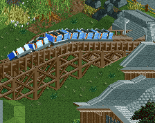
Screenshot / JWAK - Outback mining!
-
 27-February 17
-
 Jappy's Wildland Adventure Kingdom
-

 5 of 14
- Views 3,026
- Fans 3
- Comments 21
-
 Description
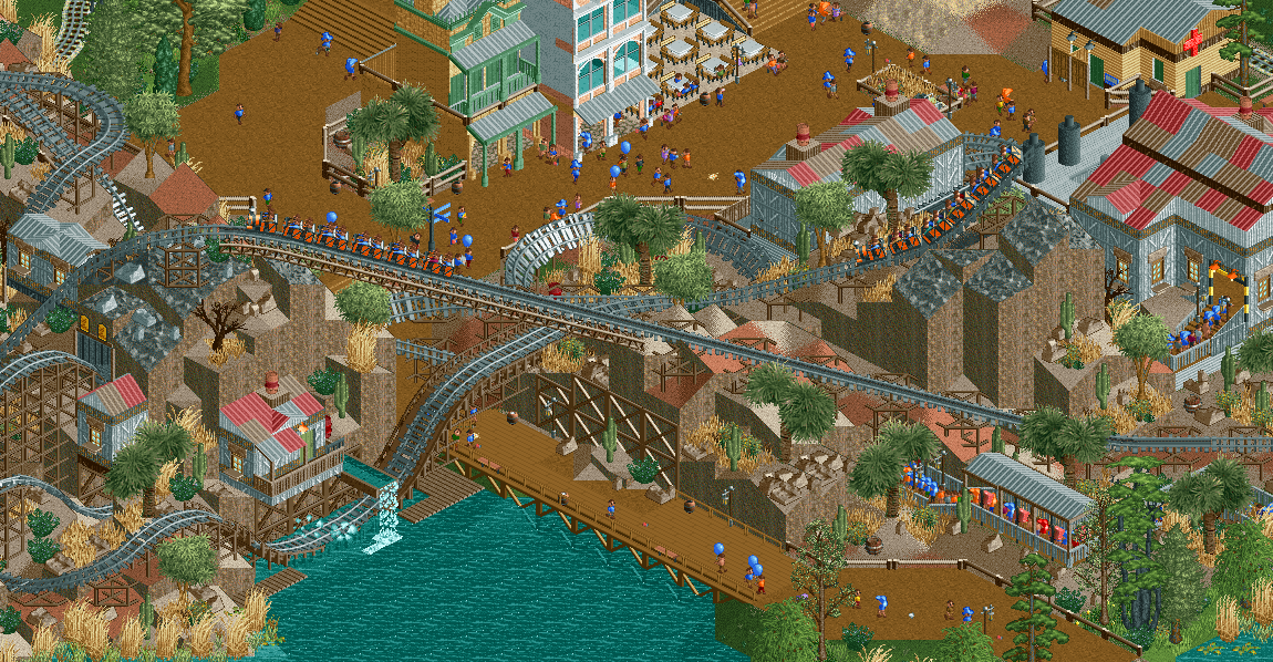
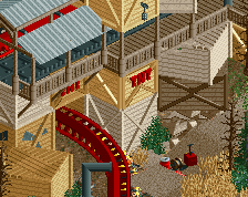
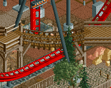
Hold on to your spine! You're gonna need a hard hat and nerves of steel to survive this ride in the Outback! The Waicuckoo Mountain Mining Co needs your help! Climb aboard for the wackiest ride in the Outback!
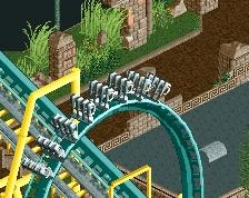
I wanted to create a coaster that's sort of a mix between Big Thunder Moutain and Expedition Everest. I'm extremely happy with the results, as it looks exactly as I wanted and the revesing parts work great.
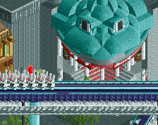
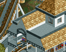
I know this might not look that Australian, but know that this is exactly how I wnated it to look. I tried the red rock for that typical Outback feeling, but honestly it looked aweful. And it's still my park, so I have the last say! :p Now it's more of a blend and it works IMO. The archy is based off some abandoned mines, complete with the sun bleached wood, and the two shops are inspired by some buildings in Kalgoorlie. -
 Full-Size
-
3 fans
 Fans of this screenshot
-
 Tags
Tags
So, where exactly is the BTMRR influence?
Expedition Everest makes sense enough, as switch tracks are clearly an element here.
I think Jappy's had a train revolution
The archy looks nice, I think my biggest complaint here is the roofs. You had the right idea going when you mixed the colors together, but I think in the end it just doesn't work that well. I'd suggest trying to get some Dach(bretter) objects in there to mix up the roofs a bit.
I'm guessing the Big Thunder Mountain influence comes from the low level mountainous environment with aspects of theming built into the walls of the mountain.
Personally, I definitely get both BTM and Expedition Everest vibes from the ride.
I really like the first aid/restroom building in the background up there.
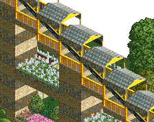
Multi-color steel roof tiles? Now you're speaking my language.
well played
So the coaster looks really nice, I like how everything is set up and planned for the most part too, nice interaction and all that. However, I think you could replace the grey with a different color to make it a bit more appealing in that respect, grey on grey for the tracks is a bit dull.
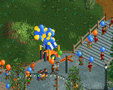
My issues come with the path and boardwalk you have there, as its all quite simplistic and bare. I'm not really sure what parks your drawing inspiration from in terms of a parkmaking sense, but I'd try and explore some Google street view from Disney or Busch Gardens to gets some ideas on how to liven up your paths.
I generally feel that you can go another level deeper in terms of detail ands and object density, at least in some more focused areas, like this. Some just feels a slight bit bare, and it keeps it from really breaking through to that next level in my eyes.
Beautiful. Could possibly be my favourite screen from you. Great job.
I love the way how the coaster goes over the path. Architecture and foliage is great too. Path could be a little bit better and more interesting though, i really see some great space for small awesome details here.
Thanks for the nice comments everyone!
@imlegos: look at CoasterCreator9 his comment, he hit the nail on the head.
@YoloSweggLord: I've always been into trains, nothing new! I'll take a look at that object, but I haven't got any small object slots left. I have to be careful and thoughtful when I decide to replace objects now. Glad you like the first aid building;
@Coasterbill, spacek531: I assume you guys like it?
@G Force: glad to hear you like most of it! I mainly take my inspiration for this park not from any theme park, but from a zoo. Mainly Pairi Daiza in Belgium. Obviously they don't have a mining area so I just went with what was in my head. I'll take a look at those parks to see if I can get some more inspiration. Do keep in mind not all of this is finished stuff though.
@Bubbsy41, Lagom: thanks guys, great to hear!
@RWE: glad to hear you like it! Care to share any of those awesome detail ideas?
This. I want to see more of this. Excellent job.
feel like the station is very weak shape and texture wise... You can do better I think
I agree, you can do better. To be honest there is nothing in this screen that is not messy or unrefined.
Quite like this screen. The coloring on the steel roofs isn't good, as is the archi in the top, but that dip-dive makes it all worth it for me.
Bottom left corner cropped out could've made this one of your best screens for me.
Okay, I'm excited for this.
Uh yeah, this looks nice but is not Australia haha.
@RCT2day: Thank you! Nice compliment!
@BelgianGuy: well, the station is actually based off a real-life design of mine in Australia that already hasn't got that much variation of shape... I actually already made some changes to the real design to make it look more varied in RCT.
@Liampie: you mean the landscape, or object use? Because IMO, I actually don't see what you mean.
@Chorkiel: well, I'll take another look at it but I tried to make it more interesting. Otherwise it's quite a boring roof.
@][ntamin22: Thank you!
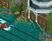
@Stoksy: I know, I know, but it'll connect to the Australian theme zone and I thought it a bit more original than just another Wild West mine train. Since it's a zoo, expect some koala's and crocodiles in the future. ;)
@Steve: Glad to hear the foliage is alright! That was something I was worrying about during building but I quite liked when finished. Nice to hear you think so too. As said above, I'll take another look at the archy. But do you mean the two shops as well? Because IMO they're fine. Keep in mind that since I posted this screen I've already added some signs and details to make them more shop-like. :)
@Faas: because it's Ocean Appreciation Day! :p