Screenshot / Teaser - El Grande
-
 26-February 17
-
 Project I: Unnamed
-
 1 of 6
- Views 3,044
- Fans 0
- Comments 14
-
 Description
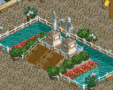
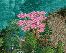
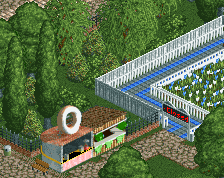
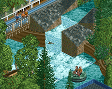
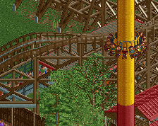
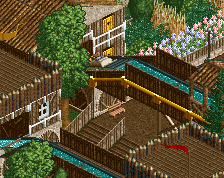
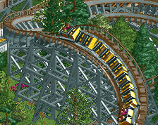
This is a teaser image for a *mostly* NCSO project with me and one other. I've done most of it for now. More teaser images of this currently unnamed park. Enjoy!
(Please note, I am open for criticism. This entire area is still unfinished, but what you see here will likely not change except for minor things). -
 Full-Size
-
 No fans of this screenshot
-
 Tags
Tags
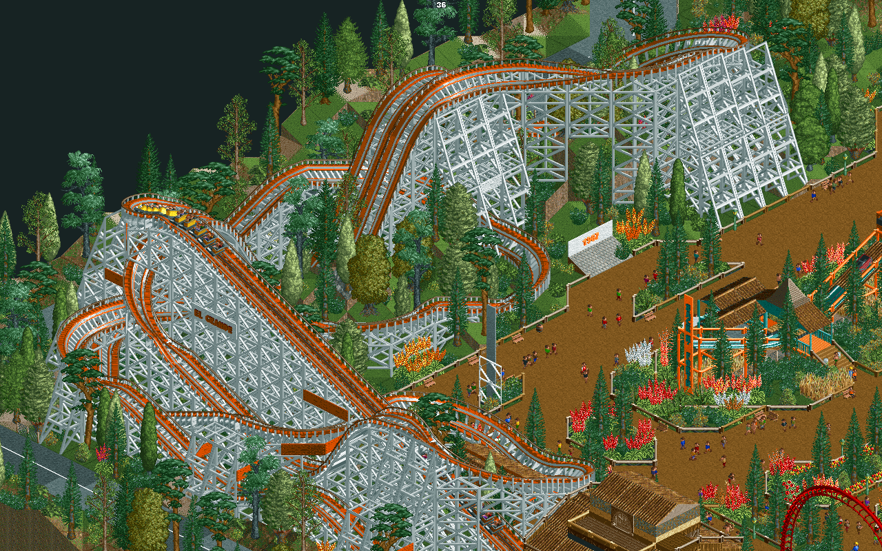
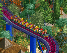
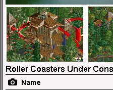
ooh what a fun unique woodie. Not a fan of the colors but like it overall
Thank you, Sensual!
As for the colours, I'm not 100% sure what I could change them too. Any brown would be too much brown, more orange = too much orange. I'll have to fiddle around some more, I guess.
Here's another angle! Dubbed the "money shot" by a friend of mine.
There's a lot of questionable choices here- the landscaping and foliage around and in between holes in the ride, the color scheme, and general composition of the area. Something that will definitely help you later on (It's probably best that you finish this on and take the criticism I'm about to give you to apply to later works) is to focus on tracked rides above everything else. How you fit path and other rides (ride integration), and structures should be primarily based on the ride accompanying the area. Get a really good layout down pat first, and plan out the area around that. (Corollary: I know this is NOT the only way to plan parks, but I find it to be the most effective way for good composition especially for players just starting out). Composition is the hardest aspect to master in RCT but it's most likely the most important one to learn.
+
I like the woodie. For NCSO, this is pretty good. I also like the foliage. You've made a smart choice by changing the default land texture, it makes it feel hectic (in a good way). The station is pretty good as well.
-
Some fences don't have the same color. I'd suggest you to let them be more 'uniform' and choose one color only. Speaking about colors, I didn't like the woodies's colors either.
Overall, pretty good, nice feel and atmosphere, but you need to change some things in my opinion.
The coaster does look pretty badass from that second angle. The turn on the right bothers me however. If the banking starts one tile sooner, slightly before the top of the hill instead of after, it will look much smoother. I would always try to extand the banking on hill tops like that. In the first screen I see one other spot where this would apply.
You've really improved your style, Blazing. That butterfly ride is quite cute!
I'm trying to pinpoint where you're talking about in both screens. I'll see if I can figure out the issue in game, or if you can point out where the issue is.
Liam is talking about this turn.
looks very nice to me! im getting reminded of twister ii at elitch gardens a little!
It's been a long while since this has been updated. I took most everyone's suggestions.
Composition is one thing I have not perfected (probably never will), but, things have changed.
1: Woodie colour is way different (as per dislike of many)
2: The fences are fixed
3: some of the abrupt turns have been fixed
4: probably something else, but I forget.
As per usual, more is to come as this area still is not finished. More critiques welcome, and of course, thank you for them!
Why such a low rating for this image? The coaster's layout is quite nice IMO.
much improved
Thanks everyone!