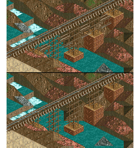
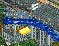
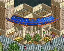
Screenshot / Bridge 1 or 2?
-
 25-February 17
- Views 1,670
- Fans 0
- Comments 17
-
 Description
It's been a hell of a month, I can't believe I even opened up LL again. It's good to be back working on this project.
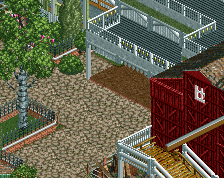
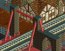
I like the first bridge in theory but it ended up being messier than I had hoped. Is it still worth it to use? Looking for thoughts on this -
 Full-Size
-
 No fans of this screenshot
-
 Tags
Tags

I prefer 1, also love your username
Thank you and thank you
1
1
2, for sure... I'm disappointed in you all.
edit: The guys below me make my post sound like a joke but I'm serious
4
Jk 1, but there is definitely still room for improvement, I don't like the footers
2
1 makes no sense, 2 should be the one to go for!
2
Without tryna look like an ass-kiss. I meant 2 instead of 1. Simplicity is usually king.
I agree with 2