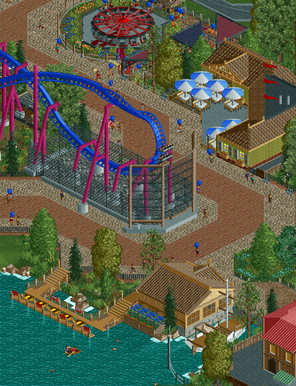
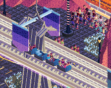
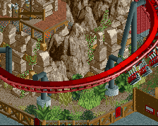
Oof, that netting/fencing is really ugly. Could it be at all possible to sink that element below the pathing? Just the combination of object texture and height difference is not appealing
I love the fence, but I would like to see the diagonal sides of it drop a fence so it becomes stepped, would make it less harsh, but still awesome.
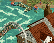
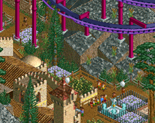
The enterprise looks appropriately abandoned too, the flowers and foliage around it suggest a lack of care and attention to the ride, its a nice realistic touch, not sure if intentional or not.
Let me look this over before you submit it to give you some feedback?
Looking at it again, I almost don't think the fence is necessary. Maybe a small netting like Talon at Dorney, but what you have now is just way overkill and honestly just feels like an out of place attempt to mimic Starpointe.
I love the fence, but I would like to see the diagonal sides of it drop a fence so it becomes stepped, would make it less harsh, but still awesome.
The enterprise looks appropriately abandoned too, the flowers and foliage around it suggest a lack of care and attention to the ride, its a nice realistic touch, not sure if intentional or not.
Let me look this over before you submit it to give you some feedback?
sure I'd love to get some feedback like that once it's closer to being finished. also i was trying to go for an alpengiest-ish feel with the netting. and it is supposed to be netting not a fence. If anyone has any ideas for better netting please let me know.
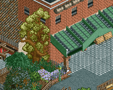
Would look infinitely better with some planters with tall trees to sort of blend it in a bit better. I do think it could be a little shorter though. Surroundings look nice otherwise!
Such a hostile welcome... geez. But my quote was referring to the fences. Make them less noticeable, using thin black poles instead of thick wooden ones. I'd suggest you make the land underneath NOT rock either.
 20-February 17
Oof, that netting/fencing is really ugly. Could it be at all possible to sink that element below the pathing? Just the combination of object texture and height difference is not appealing
I agree about that fence but everything else looks amaziiiing !
I love the fence, but I would like to see the diagonal sides of it drop a fence so it becomes stepped, would make it less harsh, but still awesome.
The enterprise looks appropriately abandoned too, the flowers and foliage around it suggest a lack of care and attention to the ride, its a nice realistic touch, not sure if intentional or not.
Let me look this over before you submit it to give you some feedback?
I agree with Louis about the fence. Maybe if you colour it grey it will blend in better and not take up so much "space", visually speaking?
Looking at it again, I almost don't think the fence is necessary. Maybe a small netting like Talon at Dorney, but what you have now is just way overkill and honestly just feels like an out of place attempt to mimic Starpointe.
sure I'd love to get some feedback like that once it's closer to being finished. also i was trying to go for an alpengiest-ish feel with the netting. and it is supposed to be netting not a fence. If anyone has any ideas for better netting please let me know.
Will look fine if you lose the top 3 rows imo.
The fence just feels a bit too huge imo. Otherwise this looks really cool! Looking forward to this!
Idk I like the net to much to remove it. is there anything around it that would make it look better instead?
Would look infinitely better with some planters with tall trees to sort of blend it in a bit better. I do think it could be a little shorter though. Surroundings look nice otherwise!
If you are going to take a shit in the name of realism, make it a pretty shit.
Or give proper feedback and maybe it will be better appreciated than trying to pretend you are some sort of RCT god which you aren't.
Tbh I don't think the fence is really needed here. A much smaller, more decorative one would look just fine.