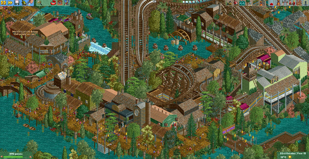
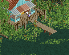
Screenshot / The Bayou - reddit february contest
-
 12-February 17
- Views 3,282
- Fans 12
- Comments 23
-
 Description
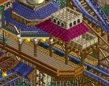
Heyo, I just submitted an entry for the reddit february contest. I'll also be uploading here shortly, although with a little bit of extra cso to make it pop where it couldn't quite in vanilla, and a bit of expanding stuff on the borders as I couldn't change any of that in the contest rules.
-
 Full-Size
-
12 fans
 Fans of this screenshot
-
 Tags
Tags
Ah Cocoa, always a pleasure to see your work.
Really love the use of the elevated path, it's a great idea that isn't used too much.
Sorry to dig this screen up – but now we’re talking.
This is really excellent and reminds me a lot of Fatha’s work. And I do not mean this in a derivative sense but because you forsake the latest trends—“realism” and crude overuse of custom scenery—and favour atmosphere above everything else.
It also reminds me of Fatha’s style because you take a risk with detail. With a little less control here, this could have easily spiralled into being too overwhelming for the viewer. But like Fatha’, you keep control and everything has its place. I don’t know how familiar you are with Fatha’s BGSS but I would recommend you check it out. It was released in a time of hyper custom scenery craziness (fantasy parkmaking was in full throttle with some really imaginative stuff being put out, mind you) and I always saw BGSS as Fatha’s response to that period of parkmaking.
And in your time where realism seems to reign, I wouldn’t be surprised if this is very refreshing for a lot of people.
A couple of suggestions:
First and the most minor – I think the wooden could benefit from a richer colour scheme.
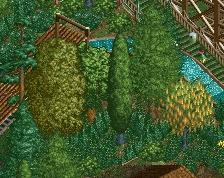
Second – I think your landscaping could improve and it’s in your favour to really spend some time developing this.
Lastly and the most important – I have had a quick look at your previous five screens and I must admit there is a huge difference in the quality between them and this one. Maybe you’re undergoing a transitional period in parkmaking and currently warming into your own or a new style. But I say pursue the aesthetic you have found in this screen, because a full-scale park of this quality would be an upper tier spotlight for sure and an absolute pleasure to view.
Nonetheless, don’t take these little suggestions as negative criticism. This is really good work - it’s old school yet feels refreshing and, above all, it has real class.
cheers artist, never thought I'd have you comment on one my screens haha.
This park is actually released, so too late on the feedback- you can find it (with a full screen overview since you don't have the game) in the parks section.
Also I'm not a particularly new around here, I've definitely seen BGSS haha