Screenshot / Six Flags Emporium
-
 12-February 17
-
 Six Flags Magic Mountain 2022
-

 4 of 9
- Views 1,941
- Fans 0
- Comments 7
-
 Description
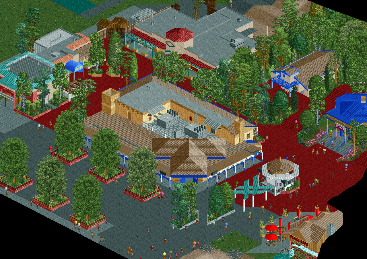
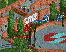
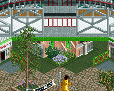
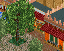
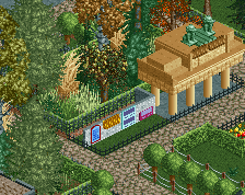
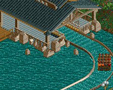
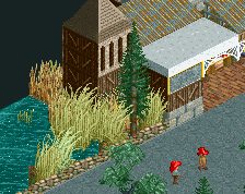
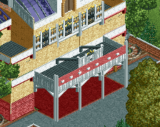
This is the Six Flags Magic Mountain Entrance Plaza again. I rebuilt most of the main building, also making it much more accurate to real life. The Flash Pass/Lockers building was also edited to be more accurate. I made sure to have more things going on with the large roofs so it isn't as boring but still realistic. New editions are the guest services building on the left which also has the lost and found. Currently in progress is the Plaza Cafe on the bottom right.
-
 Full-Size
-
 No fans of this screenshot
-
 Tags
Tags
For reference, this was before: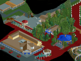
The red path is burning in my eyes.
The adding of benches and trashcans has helped a lot with the atmosphere, but it could use more!
It is however a very good screen, and an improvement over the previous situation. Keep the work up!
I don't think it's that bad here because it isn't that overpowering. It's been used with care.
Much better well done.
Its better, but he planters still need work. Use less weeds and grass and more gardens and shrubs, wouldn't it be odd to go to a park that has all their tree planters and gardens replaced with ugly weeds and long grass?
Again, I think some of the color and texture choice is weird, too much brown, but it shows promise.