Screenshot / JWAK - Land of Origins
-
 07-February 17
-
 Jappy's Wildland Adventure Kingdom
-

 4 of 14
- Views 1,730
- Fans 2
- Comments 11
-
 Description
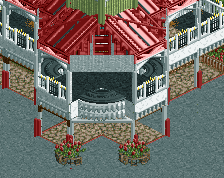
Africa... The mysterious continent, the origins of life! Discover the amazing wildlife this great part of the world has to offer, or stroll through our African village with its many shops and food stalls selling local cuisine. Or take on the mighty Cobra in a thrilling ride through the Savannah!
-
 Full-Size
-
2 fans
 Fans of this screenshot
-
 Tags
Tags
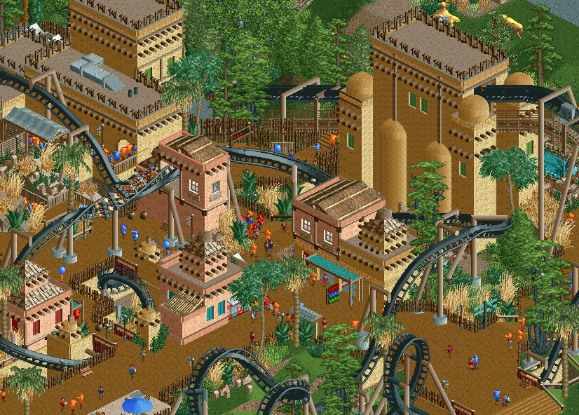
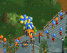
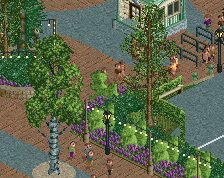
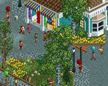
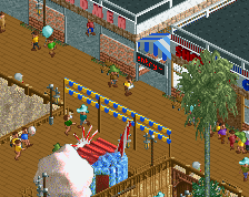
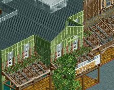
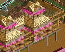
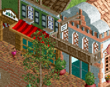
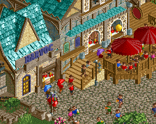
Dope. Could do more with the texture work though (all the buildings are the same texture, add some brick), also probably shouldn't be (as much) grass by the cobra roll or first drop.
Really nicely done! I'd agree that a little bit more texture would take it to the next level.
I love the Phantasialand inspiration.
We need some baobab trees...
sexy coaster-path interaction.
Basically agreed with everything said about more texture. Looking great!
I don't quite understand the coaster. You have a rather huge first drop it seems and then you have the smaller loop/cobra roll following? And then that hill after the cobra is much taller than the inversions prior? Might just be the angle or just because we can't see all of it. How's the pacing?
Thanks erveyone for the replies!
@Stoksy: I'll mix in some brick to add some variation. Thanks for the tip!
@trav: glad you like it! Like I said I'll add in some texture.
@Coasterbill: well spotted! Not that it was that difficult though.
@Ekspert: I actually have some, but I didn't use them as I think the textures don't match the game.
@Yolo: That's something I really wanted and I think I made it work. Glad to hear you like it!
@Coastercreator9: Thanks!
@Steve: Don't worry, I've only shown the finished half. The left half of the village is still unfinished, so I'll be able to mix in some more foliage. Glad to hear you think I'm improving on it! It wasn't easy to find a balance between the "filler foliage" and the "themed foliage" from Africa but I think i pulled it off. The coaster is fine actually, good pacing all throughout the layout IMO. Fast where it should be and slower where it should be. Maybe it's just the angle?
@RWE: Nver enough is my motto! Well, not really... But glad you like it!
Happy to hear so many of you like this screen, makes me want to build some more on this.
Never thought you would do THIS with that coaster you showed me. Jappy, for me, your best screen you showed on NE ever! Fantastic immersion of the coaster in the environment/zone, Great interaction. Archy is good too but I agree it needs more texture.
v nice