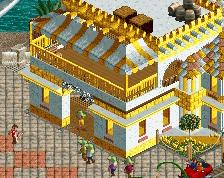
Screenshot / Polka Square Surroundings
-
 06-February 17
-
 Melody of the Light
-

 11 of 18
- Views 1,460
- Fans 0
- Comments 3
-
 Description
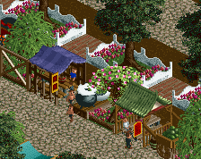
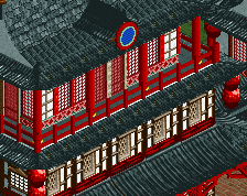
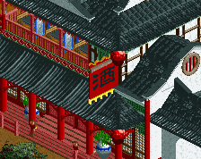
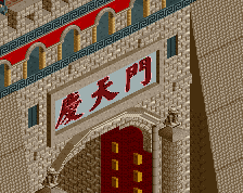
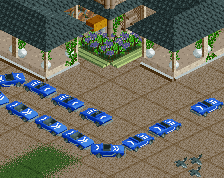
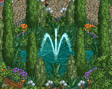
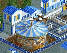
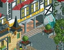
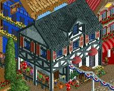
Go back to the start, Polka Carousel. The structures are divided into two different styles because I'm watching and learning. And the island is 80% completed.
*I'm sorry I don't have enough time to modify my buildings, but I will try my best to complete this project.* -
 Full-Size
-
 No fans of this screenshot
-
 Tags
Tags
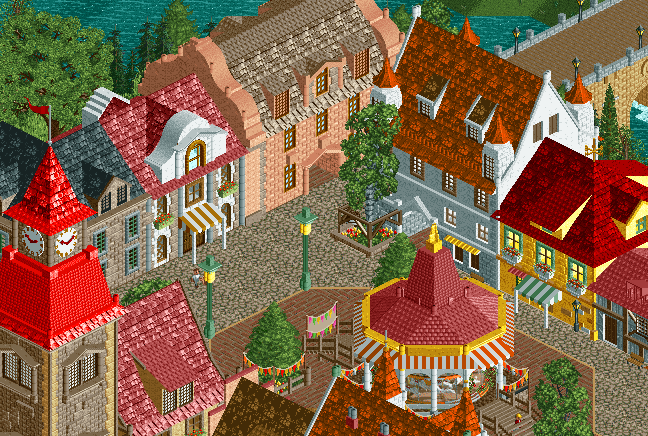
Those two light poles look really nice, but also very large on a peep-scale sense. I do like the rest though!
Edit: Now that I'm staring at an actual streetlight, it does seem to be in the proper scale. I agree with what G Force said about the red; it's the one thing that I thought was out of place, but it didn't bother me too much.
You nailed those lamp posts.
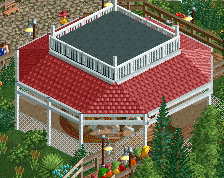
Overall its good, but some of the brighter colors seem a bit out of place at times, especially that red on the left.
Actually. Red roof looks more like a painted like a car. I think the pastel colors best reflect the atmosphere of walls and roofs, but they can always hit up some exceptions ...