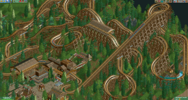
I agree the layout is a little long but besides that I think it follows the terrain pretty well. The first half of the coaster looks pretty good, the foliage on the other hand looks more like an after-thought. It should've been denser, I feel, and using the dirt/grass ground texture throughout would've given it a more convincing forest look. Architecture is nice though, nothing to complain about there!
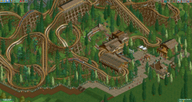
I think this is pretty cool, would definitely make for an awesome rider experience. Good use of the MCBR building and the waterfall area to build some drama and interest as the layout goes on, as well as the interaction/visibility with the path in the latter half.
More pics

Not a huge fan, it doesn't really seem to work with the terrain for a terrain coaster, it just takes up a ton of space. Not bad though, pretty good
GCI coasters dont ever have MCBRs.
This reminds me alot of my old coaster: http://www.nedesigns...4-r7-landslide/
Maybe its just me...
I agree the layout is a little long but besides that I think it follows the terrain pretty well. The first half of the coaster looks pretty good, the foliage on the other hand looks more like an after-thought. It should've been denser, I feel, and using the dirt/grass ground texture throughout would've given it a more convincing forest look. Architecture is nice though, nothing to complain about there!
kilc making a coaster that touches the ground *GASP*
but seriously i wouldnt touch the ground like that
Yeah, this was a long time ago, I feel like we could do better if we tried again now. Still a fun project, even if it wasn't too realistic.
I think this is pretty cool, would definitely make for an awesome rider experience. Good use of the MCBR building and the waterfall area to build some drama and interest as the layout goes on, as well as the interaction/visibility with the path in the latter half.