Screenshot / Carousel and Plaza
-
 04-February 17
-
 Stoksy's Europe
-

 4 of 4
- Views 2,440
- Fans 6
- Comments 18
-
 Description
Vienna/Stoksy's Europe is constantly expanding. Been a while since I've posted a screen with multiplayer distractions, but I have been quite hard at work on this park for the past month or so.
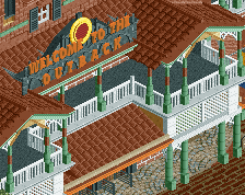
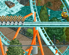
A basically finished screen, custom carousel and transition area into England. -
 Full-Size
-
6 fans
 Fans of this screenshot
-
 Tags
Tags
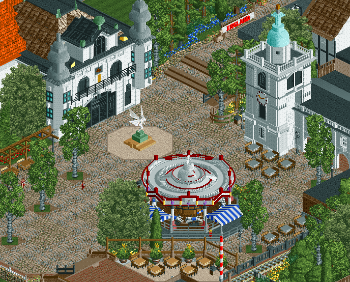
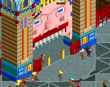
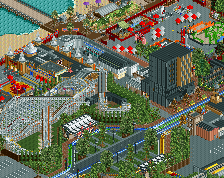
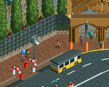
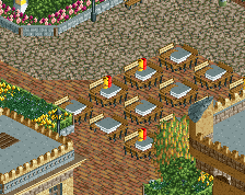
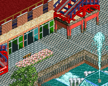
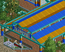
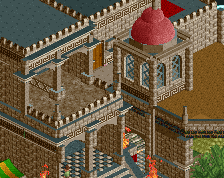
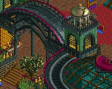
The plaza is magnificent. Love the tables and I think mixing up the paths worked really well here. Steps to england stand out a bit, is there another object that is more subtle?
More more more.
Oh man, that's awesome.
I know it's unavoidable but the textures on the grey spires(?) seem out of place. Everything else looks awesome though.
Gorgeous mate. Lovely colours in this, especially on the carousel. Love the blue awnings
The caroussel is amazing. The archy is amazing. I'm a sucker for plazas, and this one is just....amazing.
that carousel <3
The tower on the right is a bit too white, I think. The carroussel is maybe a little bit overdone, but awesome as hell.
Looks fabulous, so atmospheric! The corner towers on the building to the left look a little blocky perhaps, also the object choice for the windows isn't totally convincing, to me they look more like shutters. But those are minor complaints, the general look here is great and the atmosphere, like I said, is very strong.
Caroussel and watchtower looks crisp, nice foliage too. Only thing that bothered me is the steps on the top..look a bit blocky to me. other than that, this is dope.
Many of the problems mentioned are shortcuts due to grid placement. The grey spires should actually be windowed for example but to get windows on lower levels/have correctly scaled elements I had to take a blander approach with too much of the same texture (I'll see what I can change if anything). Same with the white tower looking a little blocky, I need certain windows on certain levels and then the tower top itself has to be smaller than what I want (should probably be 1/8th unit larger in all directions).
Steps have been changed though.
Dude I love that carousel.
Only just realized the mix of Crazy Pathing and LOTR pathing
I used to think that was only a G-force thing...
I first saw it from Pacificoaster and Paradise Pier. But he might have seen it somewhere else before that.
Liam was the first person I saw use it, probably was used before that as well to be fair.
Anywhere I can get that Carousel? God damn, I love that carousel. Excellent work, mate.
That carousel isn't a custom ride, it's a loop of steeplechase cars surrounded by custom scenery and trackitecture.