Screenshot / First LL Park for NE
-
 04-February 17
-
 French Quarter
-
 1 of 2
- Views 2,250
- Fans 1
- Comments 6
-
 Description
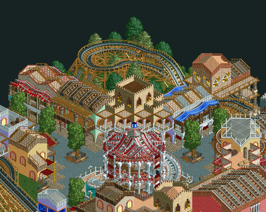
I'm making a small 29 x 29 RCTLL park I'll upload on NE when finished. I don't know when I'll be done with it, but this is slowly progressing. Also, I still don't have a name for my park, so if you have suggestions for me you're welcome.
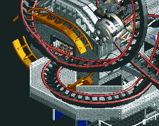
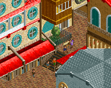
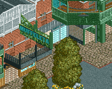
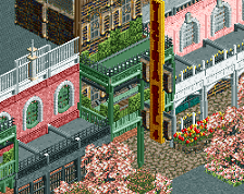
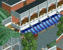
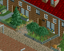
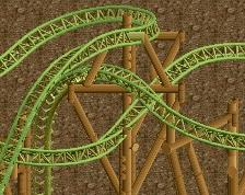
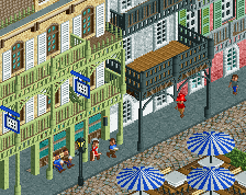
This is a park inspired by Shotguns!'s Large Nasty NCSO project and New Orleans architecture. This screenshot shows a finished part of the park plus the carrousel at the center. I'm also building a wooden roller coaster around the park, but you can only see a small portion of it.
I hope you like it. Criticism is welcome to help me build better! -
 Full-Size
-
1 fan
 Fans of this screenshot
-
 Tags
Tags
![screen_3797_[Disaster Bench] Arcan Grove Preview](https://www.nedesigns.com/uploads/screens/3797/3797_thumb.png)
Very cool looking, interesting archy for sure. Hope to see more of this!
Looks like a good start; there are some obviously WIP areas, but I'm interested to see where it goes!
Exciting stuff. Urban architecture can be very difficult to nail in LL.
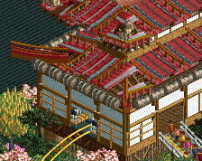
Bubbsy is right, but given the limited map size you probably did what you could. My advice would be that LL can get busy enough texturally that it is often not worth doing things like alternating path colors for the roofs or rooftop debris. In a crowded scene like this there's ample reason to give each building a single unified appearance to help it be distinctive. Since we've got a limited palette of color/texture to work with, often times your best bet is sticking with warm/cool for the overall tone of a building. You've got the right idea with cool-grey path for the purple building and red-tile path for the red-awning building.
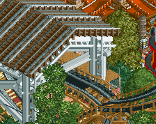
Part of why Shogo's stuff works well for this is that he takes great care to layer track and scenery so they're solid visual elements. Since you're comfortable with codex use, consider layering mine train, car ride, or inverted mini over your wooden/sidefriction roofing like he does here:
http://www.nedesigns...wharf-district/
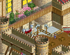
You could also tweak the path hex values on those balconies so they don't connect across buildings or just delete some of the path inside the upper levels so we see more of the wall color, that'll help clean things up as well.
Now this looks like some unique LL. Good work!
Oh this is great! Pretty cramped but that doesn't really bother me, this looks very vibrant I think, spacing it out more would've only made it less interesting. I love how you've used the abstract object as windows on that tower, and the carousel is magnificent. Not liking the tree choices around the coaster turnaround, though. I'd love to see a larger park in this style by you!