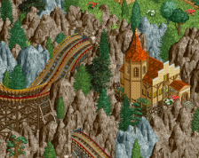
Very, very good. Great choices of textures and nice integration of the lotr rocks. The blue rooves stand out as a little too bright and/or saturated to my eyes, though.
Great stuff! I like it. I hope you add those little yellow castle walls on the right side of the grey wall as well. Feels a bit bare otherwise. I'm looking forward to see what you're gonna do with this.
It does look good, I really love the textures and shapes and you made those custom rocks look badass. The scale though, seems off to me. It's almost like the forced perspective is backwards; the levels/objects/towers should be shorter the higher up you get. Plus, I feel like a lot of the details behind the main wall are wasted because peeps from the paths wouldn't even see all those stairs and things. Unless they aren't supposed to? And you should have larger pines towards the bottom and use the small ones the higher you get up the rocks, yknow?
Overall though the architecture is really great and the forms and textures too. I guess I'm just being nitpicky.
I actually think the gray is okay and makes sense in this context. It blends well with the castle and the colors of the castle create a nice contrast, yeah, it's a lot of gray, but it works for me.
I love this. People who are telling you to change the rock color have a point. Perhaps try mixing some brown in? In the end it wouldn't make sense though for the stone to be one color and the rock to be another when the stone would have clearly been harvested from those rock outcroppings when it was built. Is this more realistic to assumed building practices? Yes. Would it looks better with brown rocks and grey brick? Probably. It's up to you!
 03-February 17
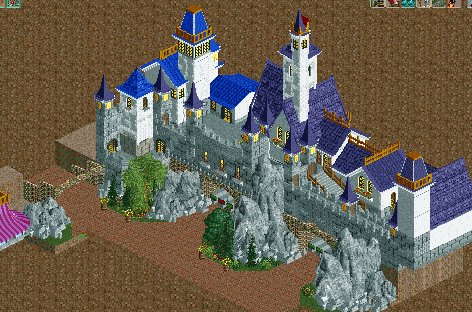
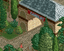
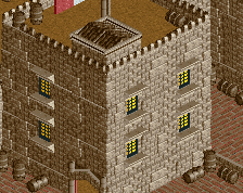
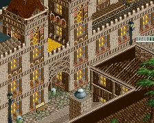
A nice start, perhaps a too much grey however. Otherwise the textures and archy is great.
been thinking bout the grey, might swap castle path colours...
Absolutely adore all your fantasy/fairytale work. Fair point about the grey
I love the grey, just dislike the purple roof, I think that is what is causing it to feel too grey. I'd keep the roofs blue, makes it brighter.
Looks great! I agree about the roof colors though...
Very, very good. Great choices of textures and nice integration of the lotr rocks. The blue rooves stand out as a little too bright and/or saturated to my eyes, though.
Great stuff! I like it. I hope you add those little yellow castle walls on the right side of the grey wall as well. Feels a bit bare otherwise. I'm looking forward to see what you're gonna do with this.
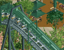
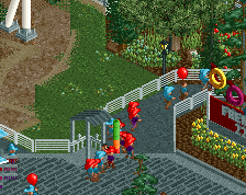
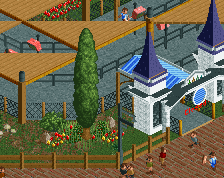
I remember my attempt of this, this kinda reminds me a mix of Island of Adventure
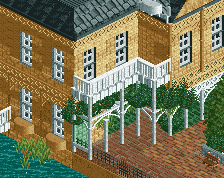
I think this is the first time I ever thought that large brick object looked good.
Overall though the architecture is really great and the forms and textures too. I guess I'm just being nitpicky.
Love it. More.
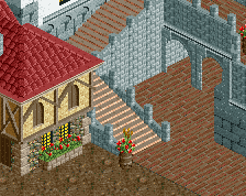
Lovely archy, great texture use. Like said before, change the rocks to brown, because it's a bit too gray now. Curious for more!
This is so good
I love this. People who are telling you to change the rock color have a point. Perhaps try mixing some brown in? In the end it wouldn't make sense though for the stone to be one color and the rock to be another when the stone would have clearly been harvested from those rock outcroppings when it was built. Is this more realistic to assumed building practices? Yes. Would it looks better with brown rocks and grey brick? Probably. It's up to you!