Screenshot / TerraVentura
-
 01-February 17
-
TerraVentura
-
1 of 15
- Views 2,054
- Fans 0
- Comments 17
-
Description
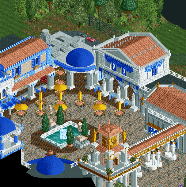
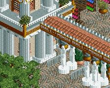
Enter TerraVentura and discover all the beauty human civilization have to offer on different parts of the world!
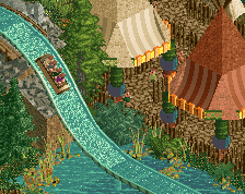
You enter the park via a cosy Greek square. Thirsty? Have a raki at Marino's. Fight your hunger with some traditional Greek baklava from Balzac's Baklava. -
Full-Size
-
No fans of this screenshot
-
Tags
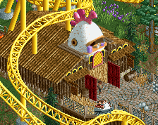
Your architecture skills are improving. I can't account for how accurate it is but it looks pretty and composed nicely. Is this the entrance area to the park or just one of the areas? Seems like foot traffic would be hindered with so many tables out in the paths -- I would remove a few maybe.
Unsure of the dark brick path but it's not bad either. Have you played around with other path types?
Needs some taller trees or some more natural planters to accentuate the buildings too, I think. Even including more of those potted trees would be welcome.
Nice work!
I agree with the tables seeming a little in the way and the addition of planters being a good idea. Really appealing structures! Perhaps the fountain could be a bit more eye catching in some way?
Well technically your park has an 'i' more in its name so not the same... It was not on purpose!
Via this square the peeps enter the park. Entrance gate is at the right. And to really enter the park, they have to go left where the park really begins. Will be clearer in other screens. Or check the entrance of Port Aventura, it's based on that one. The Greek theme will go on further than this square.
In that matter, those tables are not really in the way because if they want to go to the park directly, they can by just going left where there's enough space. If they want some food or drink, they'll have to go between the tables yes. I'll see if I can add some more trees/planters.
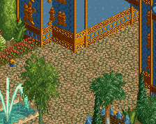
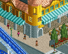
The shapes are great but there's too much blue I'd say. Also, I'd paint that columns fence (or whatever the object's called, the one around the fountain and some of the rooves) grey instead of white, in white it looks to bright and flat while in grey it still looks white but you can actually make out the shapes of it better, and it harmonizes better with other textures in white.
YES more light blue
Lose most of the blue accents except for the roofs, awnings etc. Actually really like the screen, especially the dark brick path.
I actually quite like the dark brick, and I think all the blue accents are set off really well by the yellow umbrellas. I think losing the blue accents would be compromising what you were originally going for.
Wow great stuff, Fred! I really like it! Not sure about the path though, the textures just don't feel right in my eyes..
I agree with the path thing. The brick texture looks too intense, though tbf I've always thought that texture looked so off from the other in-game textures. As for the curvy tile whatchamacallit path, just pull a G-Force and mix it with some cobblestone.
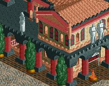
Cocoa gets colours. The dark brick is a nice contrast, but shouldn't be the interior and exterior paths of those buildings. I think that's the bigger issue.
I was actually thinking about that; what if it were just inside?
Kind of just feels that the structures are floating on top of the paths. I think you can do a bit more to differentiate the interior from the exterior spaces. Perhaps add a bit more detail to the fences and path.
Listened to the feedback, and this is how it looks like with the changes suggested:
- Changed the dark blue to light blue
- Added some more trees, near buildings
- Deleted some tables
- Painted the fence columns and statues gray
- Placed a few cocacola vending machines inside the shops
I really like the path types, and think they fit the theme well. Won't change them. Also not very keen on detailing the inside of the shops too much because of... object data limit.
G Force: what do you suggest with adding more detail to the fences and path? Thought the path is filled enough to not make it plain and boring but suggestions are always welcome
Perhaps some custom fence base pieces, just to accent the fences a bit more.
But the interiors look good now, it always kind of looks off to me when there is open air building with nothing inside of it, but you did a good job fixing that.
Yeah, I like the path choices much better now.
That is much better. Fantastic.