Screenshot / needs more work
-
 31-January 17
- Views 1,048
- Fans 0
- Comments 4
-
 Description
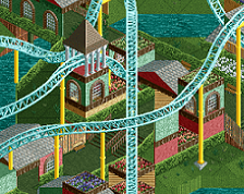
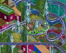
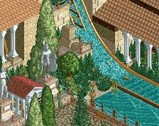
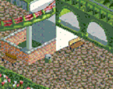
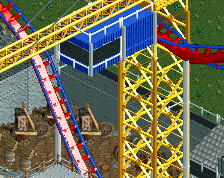
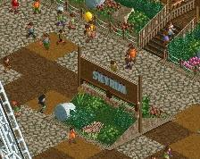
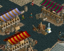
Still working on this. I've changed the way the cubes are colored and I think it looks really cool now. You can pick up a lot of motion from the mess of peeps, cars and karts underneath the cubes and I think it's a neat effect. I've also added a few support details to the floorless coaster, although I may add more yet. I left the (very) unfinished part in the bottom of the screenshot so you can see the kind of chaos that I'm trying to build around. This is more an experiment for myself than anything else and I definitely expect some strong opinions, but hey, it's fun.
-
 Full-Size
-
 No fans of this screenshot
-
 Tags
Tags
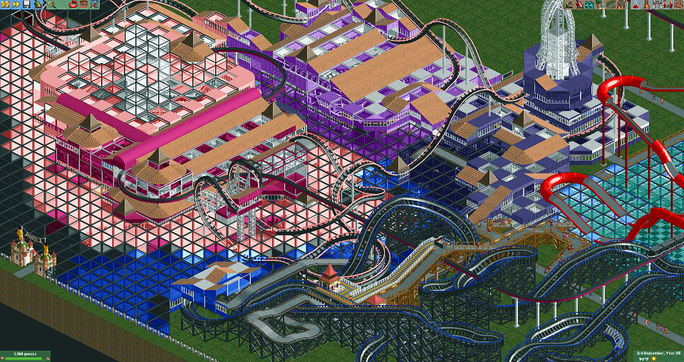
I love crazy shit when it's well done. I think you have some good ideas here, but the result is very sloppy and frankly ugly. When I look at the coasters I don't think any real thought went into the composition.
This just looks like a metric fuckload of glass cubes to me.
Agree with Liam, mostly on the coasters. The gradient effects with the cubes is pretty neat.
Yeah, I was anticipating this kind of response and to be honest I don't disagree with it, especially from only still pictures. I honestly think it's a neat area seeing it in game, and my plan is for large parts of the woodie to be contained in buildings just like the other coaster, so I think (hope) leaving the unfinished bits in the screenshot made the rest of the screenshot look even worse than it already did.
I don't know if I'm ever going to finish this, much less submit it, but it's been a fun experiment that I want to keep playing with.