Screenshot / Port of Parenzo - Port 2k17
-
 17-January 17
-
 Port of Parenzo
-

 3 of 6
- Views 2,507
- Fans 2
- Comments 13
-
 Description
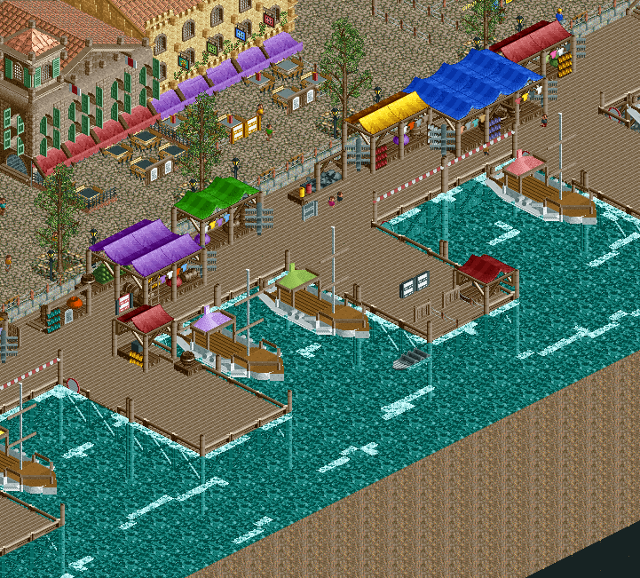
The City of Parenzo invites tourists from all over the world to many different activities in the City's port, which is known for being one of the most beautiful and lively world heritages in Europe!
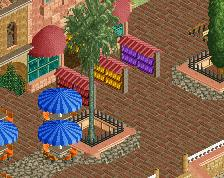
Take a seat in one of the notable Italian restaurants and cafès or walk over the pier and have a look on the finest street shops and stalls of Italy!
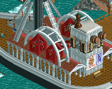
And if you feel for something really adventurous, get yourself on a speedboat and do a tour through one of the most beautiful ports of the Mediterranean Sea! -
 Full-Size
-
2 fans
 Fans of this screenshot
-
 Tags
Tags
love this. so good <3
I really like this! I love those postcard racks you can find in pretty much every tourist city in Southern Europe.
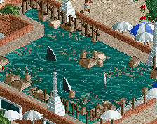
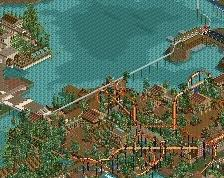
I do however suggest you to change the texture under the water. It looks way too busy now.
Maybe try a different land texture for the underwater bits? Like sand or mud, the rocks are a bit to contrasting and become a bit distracting.
You're developing rapidly.
The 3 ground textures (water, wood planks, crazy path) are a little jarring together like this, but overall I really like it. Developing a nice atmosphere.
Thank you for your comments! Glad to see i'm improving!
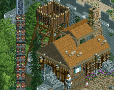
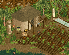
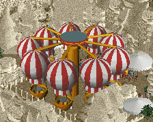
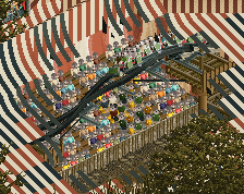
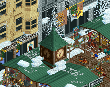
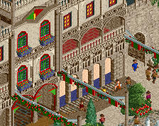
Here you can see how the area looked last year btw:
Thank you all. I really should care more about things like textures and stuff. Have dirt texture for underwater now!
-----------------
Btw everybody: The next screenshot of this project will come soon. I'm progressing really fast at the moment, because i need to stay at home while having a slight cold, so I have plenty of time!
I loved the rock texture under the water, I thought it was unique, added almost a real life texture to it, dirt under water like normal is good, but I felt in this instance, the rock really added and made the difference to the screen.
I also think having the water raised right up to the dock level is also unique, another thing I love about the screen.
Again, great work, much improvement from the original screen you just posted for comparison.
The first screen was far far better.
first screen was better.
Probably my fault because I gave another bunch of comments on the first screen after the old screen got posted.
My bad. Yh, I really like that underground texture, keeps it interesting.