Screenshot / The New Revolution (VR not included)
-
 16-January 17
-
 Six Flags Magic Mountain 2022
-

 2 of 9
- Views 2,891
- Fans 0
- Comments 18
-
 Description
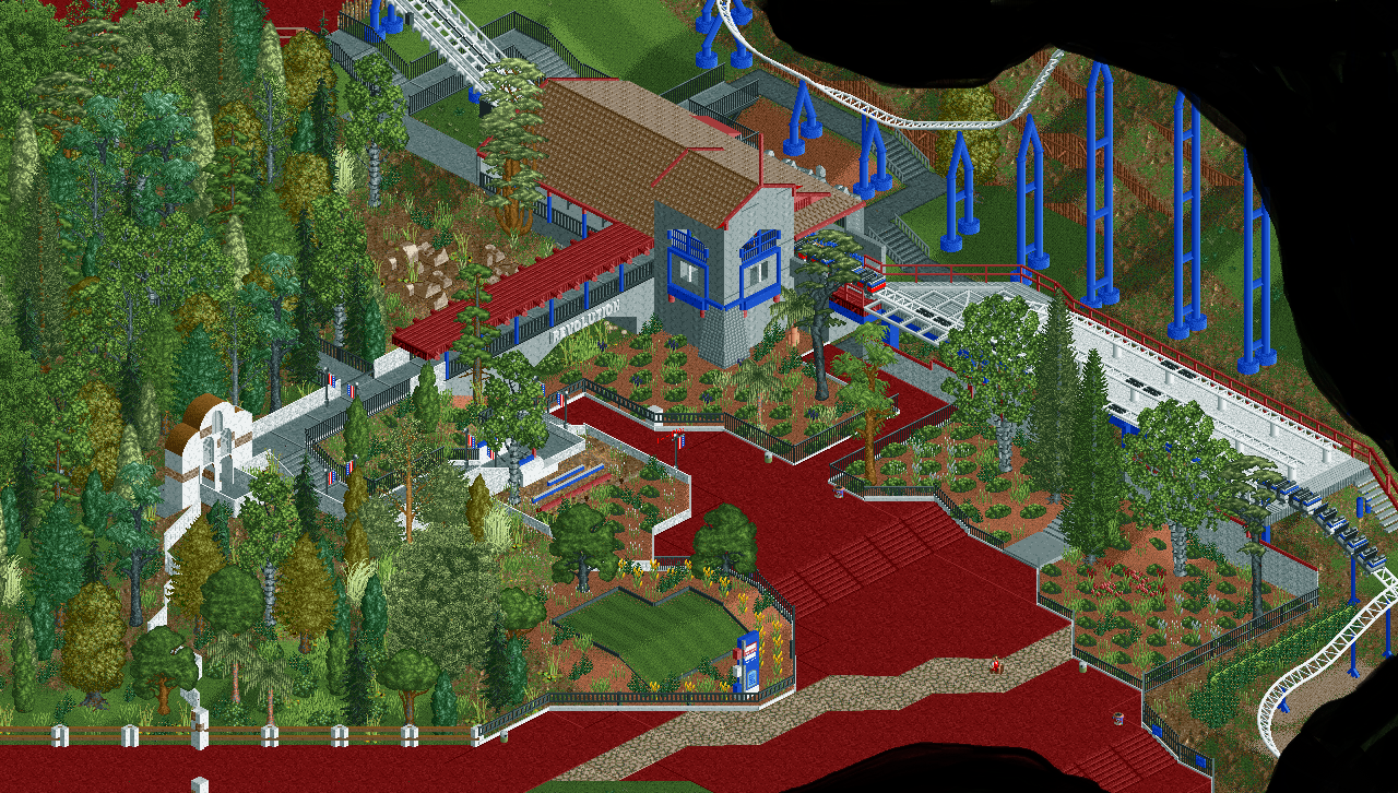
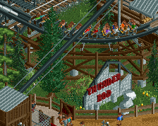
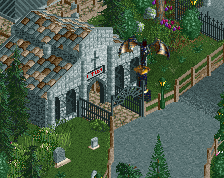
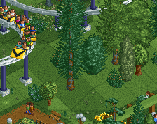
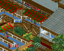
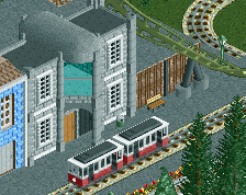
This is the next area I've been working on for my SFMM recreation. While the station wasn't really hard to translate into the grid, the Queue and plaza don't go in quite as nice. The foliage is also difficult with many skinny and very tall trees. Others are short and have a wide canopy so it is hard to get it right. I'm pretty pleased with the area as a whole though. I just gotta put in more trees around this area.
-
 Full-Size
-
 No fans of this screenshot
-
 Tags
Tags
You gotta dial back the red.
Perhaps make a custom path texture that looks a bit more like the IRL one? The red you have is just way to... red. I'd even go as far t say the default grey is more accurate in terms of color.
I don't know what the real SFMM has there but the red is just overwhelming here.
I think a significant part of it is the red path plus the red sand. I seem to recall SFMM having a more muted orange/stucco colored path there. From what I can see of the coaster layout; I'm questioning the scaling of the hill back there, there seems to be too much light slope before the steep incline making it look very angular rather than smooth.
The path in this area IRL is red, not doubt about it. However it is faded but not enough to warrant putting normal grey path. I needs to be red, but I can't make textures so I would need help with that. And this red path makes up a good quarter of the park. It starts near the entrance and runs to Viper, then to Tatsu's entrance, all the way down to Ninja's drop. The area still needs to be distinguished from the rest of the park with a red tone. But I do think it would look better with the faded red like the bridges roof.
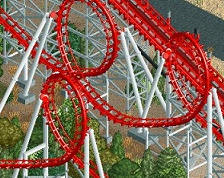
The red sand is the closest thing I can put to make it look like the red/orange-y mulch the park used to relandscape the area. As for the Rev layout, some parts are maybe a little bigger than IRL but not so much to say it is unrealistic. I can post a shot of the entire layout if you like.
The in-game revolution is so tiny compared to this.
They are actually not as different as you would think. Mine is only 600ft longer and they dont have a MCBR, and the final brake run is extremely short. Most of the hill heights are similar. I just made the first drop bigger and extended the size of the first helix.
I don't think the red path is all the problem, I think the architecture is very amateur, and the foliage very poor and this combined with the red path makes the screen look very noobish.
I think that is what the problem is.
The red path wouldn't be such a problem if that station and the foliage weren't so dire.
I've seen much better from you, so I don't know why this falls so flat.
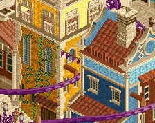
I guess I agree with this the most - I was trying to put my finger on it, and I think a big part of it is the station. If I remember correctly, the station is more cream/stucco than straight gray. I'm missing the Spanish architecture in Revolution's station with this screen.
Is this any better? I just tried to add more detail to the station. I also tried making it white but it is too bright compared to the real thing.
Definitely better, other than the path color it looks fine to me.
I quite like the red. Something different for once.
Definitely helps - I still think the station is too gray; try some of the tanner/salmon colors.
Keep the red man. Much more interesting than some boring grey or brown.
Keep the path. Fix the fence anarchy and then move on. It looks good.
Keep the red, improve the archy and foliage just a little bit, and then keep going with the park!
I love the path, I'd consider getting rid of the random crazy pathing, it is much better now, I'd still try and work on the foliage maybe, but its passable, also do what liam says, fix those fences, its a bit odd.