Screenshot / JWAK - City of Zen
-
 05-January 17
-
 Jappy's Wildland Adventure Kingdom
-

 3 of 14
- Views 2,519
- Fans 0
- Comments 8
-
 Description
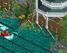
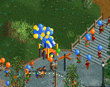
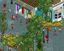
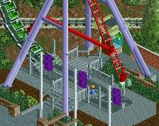
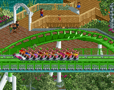
The City of Zen, Jappy's Wildland Adventure Kingdom's Chinese and Japanese area's. Discover the giant panda and the red panda in their natural habitat, but also sea amazing sea life in Mr Ping's Aquaria. When hungry, take a bit to eat in Mr Wu's Noodle Shop or a nice relaxing drink in Mr Yu's Tea House. For the adventurist, discover how the Chinese made fireworks in our enterprise Firecracker, or travelled the high seas with The Journey of Zheng He. If all this doesn't interest you, just take a nice stroll trough our gardens.
-
 Full-Size
-
 No fans of this screenshot
-
 Tags
Tags
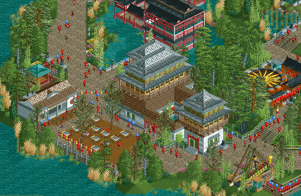
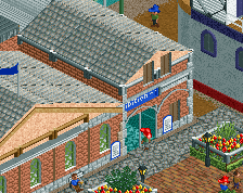
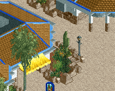
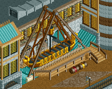
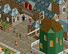
Foilage is a lot better than in your last screen. Archy is oke, not sure about all those textures and it feels kinda generic/uninspired
beautiful
My only suggestion would be to maybe add more Asian-inspired roof textures. Maybe some more of those stringed lanterns across the paths. And maybe a curb/fence on the path along the water?
Great stuff.
I feel like you could do the archy a lot better, especially the roofs. The rest looks fine! Glad to see, you've improved a lot on the foliage!
Pros:
+ Foliage is a lot better! Nice.
+ I really like the building(s) in the middle.
+ Nice colours.
Cons:
- As Tom_Dj mentioned, it's kind of generic. Your parks are normally so atmospheric. Don't let go of what made your previous parks so good, please.
- The red glass building is too blocky/boxy for asian architecture, I think.
- Not really getting the zoo-wibe.
Red pandas are nature's most adorable creatures. This is indisputable.
Too much grey. Otherwise not bad, foliage is slightly improved, but near the coast line it could use work.
Thanks all for the nice comments!
@Tom_Dj: thanks, but waht do you mean generic? I just made what I thought looked like good Asian archy. My main inspiration source were concept arts from the Kung Fu Panda movies.
@Steve: thanks! I do my best with the foliage, and I'm trying to find what works and what doesn't. I'm not sure if I'm going to change the roofs as I like them. I've added a little trim though to make them stand out more.
@RWE: well if the roofs are such a problem, what do you suggest? Using the big shogi roof pieces? Glad to hear you like the foliage.
@Lagom: at first I didn't really know what you mean with making it more atmospheric like my other parks. But then I looke at it and noticed it lacked the stuff that makes it a theme park. So I added signposts, and a little stand that sells souvenirs. I hope that is waht you mean when you say something was lacking? The paviljon/teahouse was tricky, but I modified it and it looks better now.
@][ntamin22: this guy knows what he's talking about.
@G Force: I've added some green trim to the roofs to break up the grey a bit, looks better now.
Thanks all for the feedback, I appreciate it!