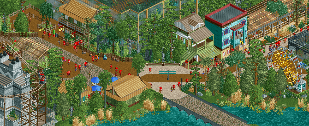
Screenshot / JWAK: The border between areas...
-
 21-December 16
-
 Jappy's Wildland Adventure Kingdom
-

 2 of 14
- Views 2,815
- Fans 1
- Comments 13
-
 Description
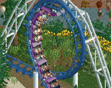
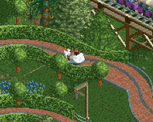
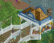
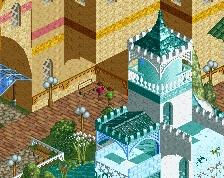
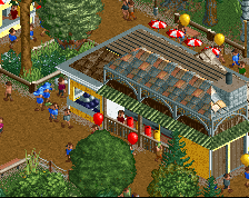
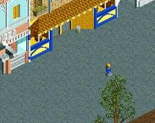
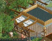
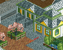
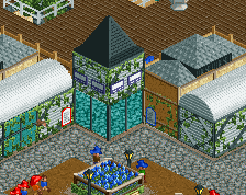
Jappy's Wildland Adventure Kingdom is coming along veeery slooowly. Nonetheless, I'm able to offer you guys another screenshot. On the left is the beginning of the Indian Zone including our coaster Escape from Shaladrivana, on the rigth is the last part of the Colonial/entrance area showing the restaurant, Expedition Essentials Shop and the first aviaries to show our collection of rare birds from around the world.
-
 Full-Size
-
1 fan
 Fans of this screenshot
-
 Tags
Tags
This is actually really nice.
I was concerned with the first screen you showed that it was going to be much the same stuff as all your other parks (you have a style where everything kind of looks similar).
But this is an improvement, you actually look like you've jumped up a skill level.
Well done.
Strange to hear, as I don't think I've approached this that much different from my other parks!
What I was worried about was the fact that it would be too similar to my first park here on NE, as in terms of concept that's basically the exact same thing. But I hope the execution and the way I've improved my skill will set this apart from Vossendal.
Nice screen, I'm looking forward to seeing more from that coaster! But I'm not sure about the foliage. I think you use too many different tree types (types that also don't go together very well). Maybe you should decide between temperate or tropical foliage to begin with.
Well, I want a mix of both. The idea is that it's a park set in Europe, so the foliage on the right hand side is going to be used all over the park. But because it's a zoo, some tropical trees have been planted to give the impression of another climate.
I've made some modifications to make it look more planted, like adding fences between the European "standard" foliage and the jungle trees.
I think the foliage looks great here! So does the rest. I basically agree with Louis. Looking forward to the next screen!
Also, too many path types. It's fine having them change between different areas but there's just a lot of them here all at once and again, doesn't harmonize.
I think if you could work on or resolve these things you'll have a great little area here!
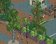
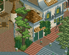
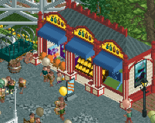
Latest fixes. Let me stress again I can't just pick a few and use those. I intend to use a different mix for every area, based on the standard set I've chosen for this project. I cleaned it up a bit and changed the path.
EDIT: let me also tell you the fact that the different set of trees are planters.
I think you need a really simple and neutral mix for the whole park. A single dominant colour, no big deviating colours although you already filtered out the ugly yellow tree. Solid trees, not the thin and high canopy ones. Then, around the edges, that's where you add variation to make the foliage fit the theme. Introduce only two to four new plant types per theme, including shrubbery. Less is more.
Not enough pianos, 2/10.
On a serious note, I think the foliage looks better, but It could still use some work. Otherwise it is a nice screen. Can't wait to see more.
I thought the foliage was good for the setting.
Why is foliage such a hot topic on my screens?! Can't anyone just tell me what they think of the architecture? Or the coaster?
I've made a few more modifications to make the planters stand out more as, well, planters, I'm gonna keep it the way it is now. Otherwise I'm going to have a nervous breakdown about some stupid virtual trees...
Oh and there are still too many path types. Again, that's just me
Foliage