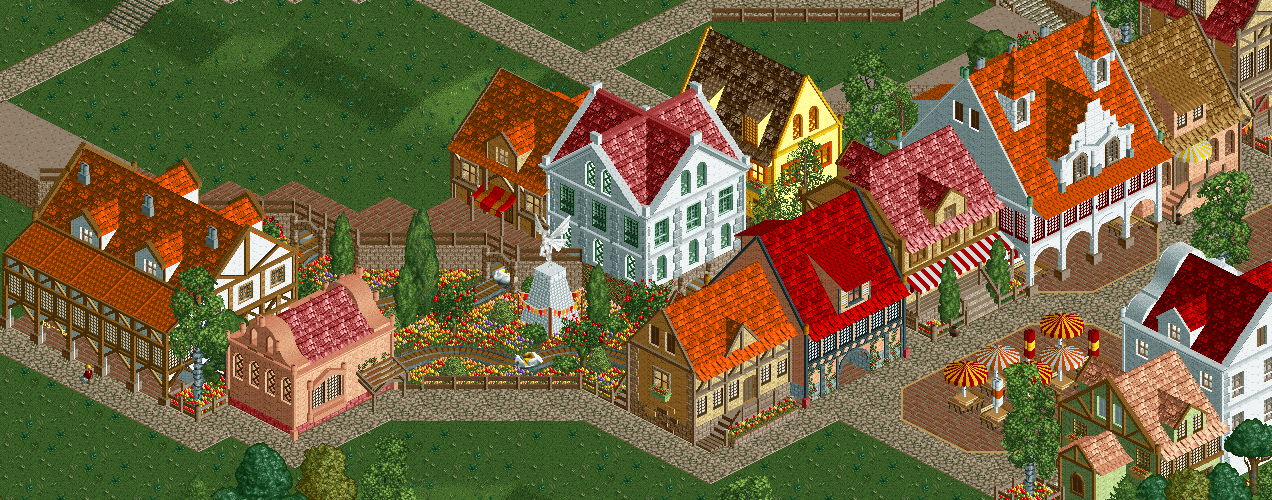
Screenshot / Some New Structures
-
 18-December 16
-
 Melody of the Light
-

 5 of 18
- Views 1,569
- Fans 1
- Comments 7
-
 Description
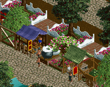
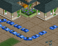
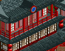
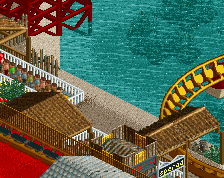
Have you noticed the cats station? I copied it from my old screenshot Hussars Station.
*My screenshots so far are snapped from only one project. First I halted because of landscape data full. Then I restarted it with a massive castle but halted again for its weirdness. Now it's the third time and it should be the last one!!* -
 Full-Size
-
1 fan
 Fans of this screenshot
-
 Tags
Tags
This is great.
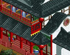
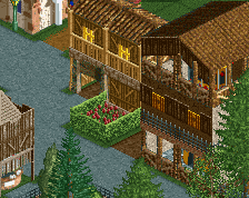
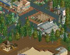
Love this! The only criticism i have is that it maybe could be cool to show the function of the buildings more with signs, outside stalls etc., just to bring this great architecture more to life.
I agree with RWE that the buildings could use more context in terms of signs and purpose. They do look rather splendid though.
So unique... so good.
Nice work.
I know its a theme area, so its gonna look a bit samey in this area, but it does look a bit too samey. Like all the buildings are the same, just changes of colour. Try and vary up some of the buildings here and there, so you don't lose the theme, but it keeps everything fresh.
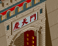
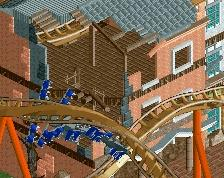
LOVE it! These architecture heavy submissions tend to be flat, so I love the the hight differences, and using that as the tunnel entrance for the ride.
the archi suffers from being too square and symmetrical. try and vary up the initial structures so they're less repeated/homogenous