Screenshot / The (ph)far(e)away Opera [unfinished]
-
 03-December 16
-
 Project Arc-tecture
-

 2 of 2
- Views 3,032
- Fans 6
- Comments 14
-
 Description
Yo all,
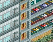
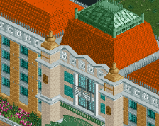
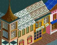
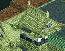
A new attempt to make an acceptable work. There's no real creativity here (at least if you know my work), I have just wanted to make a sort of work of composition (from my experiences). It's still difficult to create a nice atmosphere and to find a general equilibre (according to his considerations).
For the moment, I'm not unhappy with this work (even if we can always do better...). I have made neither waterfalls, nor two banks... I would finish later.
Don't hesitate to comment on my work. I always take my time for reading. -
 Full-Size
-
6 fans
 Fans of this screenshot
-
 Tags
Tags
![screen_3462 The (ph)far(e)away Opera [unfinished]](https://www.nedesigns.com/uploads/screens/3462/3462.png)
![screen_1764_Pluriel [unfinished]](https://www.nedesigns.com/uploads/screens/1764/1764_thumb.png)
![screen_2913_Sanctuaire [unfinished]](https://www.nedesigns.com/uploads/screens/2913/2913_thumb.png)
Ver-co Offline
up !
I've always thought your work was incredible... it's cluttered but that's what makes it so amazing. Please finish this.
well damn if this isn't incredibly detailed; almost as if you're playing an entirely different game. only thing I'd say is to be conscious of the object limit
Really unique style, is it just gonna be architecture or rides as well?
Like ito fits the rest of the game
Fantastic, as usual!
Leaves me wanting more, as usual!
Hoping you finish a project one day, as usual!
Pretty sick, as usual!
I'd say the grass roof should just be like a plain black roof or something similar, its a little distracting as it is, and I think the brick terrace to the left of the original screen should be nice manicured green grass instead of dirt and weeds
As you say, nothing new from you style-wise, but that doesn't matter at all as far as I'm concerned. Like I've said before I really like this art-RCT style you build in, and every time you post a screen it's like a christmas present! Don't change anything, just keep building! A whole map of yours would be wonderful to see!
Ver-co Offline
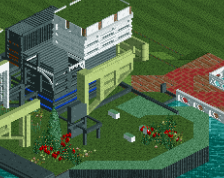
Yo all,
I up my own topic to offer yourself a few sketchs of works. Here, you will find a work really unfinished, made during the year. Maybe useless, maybe not.
I still think that every detail counts when we attempt to build something, even if we don’t see it; at least, that’s my opinion.
Happy festive season to those concerned.
Love this stuff man. It has this interesting blend of japanese and modernism that really appeals to me. Would love to you make some bigger projects instead of just single buildings! By the way, I think it would be OK if you just made a new topic for this, so people don't get confused when they see posts being over a year old.
i dont know what anything is but it looks really cool. your use of colors also really helps set the vibe.
Cool to see something different. I like how abstract it is, there's ton of possibilities for creating new RCT atmospheres.