Screenshot / Yuan's Mansion - #fiesta!2016
-
 24-November 16
-
 Stoksy's Europe
-

 3 of 4
- Views 2,049
- Fans 2
- Comments 9
-
 Description
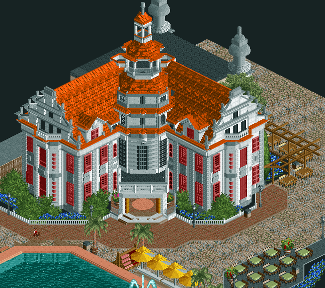
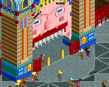
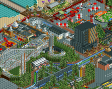
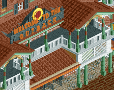
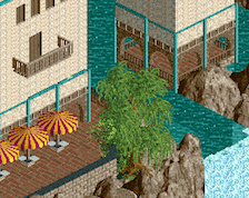
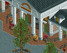
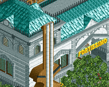
Not quite vienna, but I thought austria would suffice for the purposes of this park [upper surroundings are unfinished].
The dark orange makes for a nice contrast to the whites and light blues, it is also slightly disconnected from the main plaza and therefore serves as a nice secondary architectural focal point. -
 Full-Size
-
2 fans
 Fans of this screenshot
-
 Tags
Tags
![screen_3432_F][esta2016 - Troubador](https://www.nedesigns.com/uploads/screens/3432/3432_thumb.png)
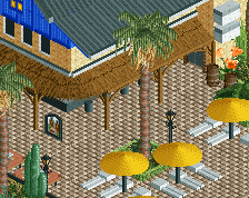
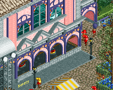
Wow, that's amazing. Not 100% sold on the red windows, or the white diagonal short fences, but looks really awesome.
Also not sure about the red windows. Rest looks amazing. One thing though: palm trees in Vienna?!
^https://thumbs.dream...er-35579736.jpg
They are specifically potted, not like they're in the natural foliage selection of the park
Is it the style of window or the fact they are red?
For me it's the fact that they are completely red. Not just the frame, but the window "backgroud colour" as well. Not sure how to call it, but I hope you undrstand what I'm talking about.
Yes! That is perfection. Lovely building. I think your best yet! (Well since the wonderful Venice micro)
reminds me of disneylhand
I must of overlooked this screen, holy damn. So much talent as usual, makes me wanna quit building lol.
The red windows look odd. Also I hate seeing people put a window on every available tile, it looks odd. I would suggest spacing them out a bit and add a bit of randomization to their placement.
Windows are supposed to be on every tile, although I understand your point: https://dreamofacity...-concession.jpg
The change in red is probably a fair suggestion though and it's changed now, using more black.