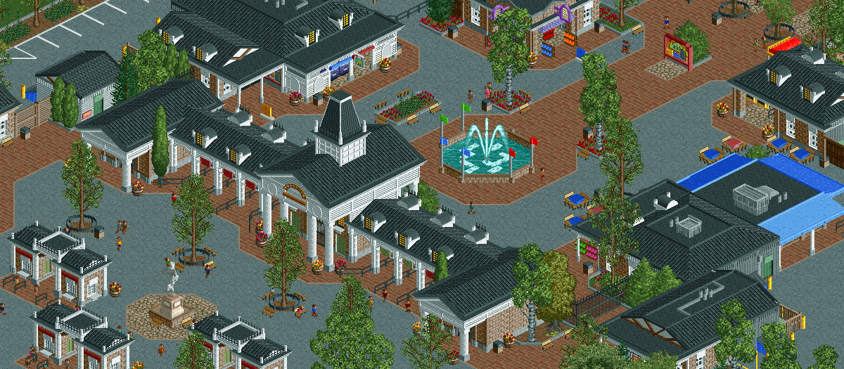
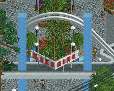
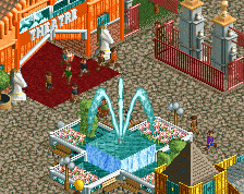
Nice screen. I'd suggest to use tarmac instead of the brick texture around the fontain. It spoils it too much for me. And I wouldn't mind to see more life in there. But apart from those things it is a very nice entrance and screen.
I agree, best entrance yet. More of the same again, but again, slightly better.
Agreed. While I love this type of park from you, I'm dying to see you tackle something with the theming of Universal or Disney. Hell, even Knotts would be fine. Still, wonderful.
It's great and I really like the kinda 'doorway' details you are tossing in. Still, feels like something I have seen lots of times and like you are more in your comfort zone than before.
I think this is one of the most real-feeling entrances I've seen in a while. great work. I especially like how well thought out and placed/detailed all the trees are.
Outside of this entrance, the small bit of park I've made on this map doesn't really satisfy me. Not really confident I can pull off any sort of theming that would fit this park, but at this point I might start over and try something at SFNE/SFA or Knott's level of theming.
Trying to change up the atmosphere a bit from WoF and WW, hopefully this is enough of a change so it just does't feel like an extension to either of those parks.
Think this is pretty much the perfect screen. Only thing that bothers me are the red and blue tables, it's a good way to add some colour but it just doesn't work for me.
 24-November 16
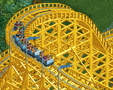
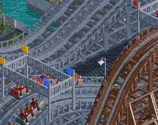
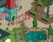
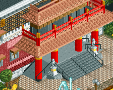
Is that a new object on the tower roof giving the white trim? I've wanted one of them for ages haha
Not that I know, just happened to have it in my object folder, its called "Six Frags Disney Roof".
downloads: 229
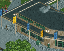
Is #Fiesta!2016 the current #Boatday or something?
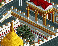
Great entrance, although it might feel a bit dark. Perhaps change the brick to the lighter brick path? Archy looks beautiful.
Really nice. I agree it could maybe use some brightening up in places. Maybe some hanging baskets or flags? Great composition anyway.
gorgeous screen, i think your best entrance yet.
I agree, best entrance yet. More of the same again, but again, slightly better.
Nice screen. I'd suggest to use tarmac instead of the brick texture around the fontain. It spoils it too much for me. And I wouldn't mind to see more life in there. But apart from those things it is a very nice entrance and screen.
It's great and I really like the kinda 'doorway' details you are tossing in. Still, feels like something I have seen lots of times and like you are more in your comfort zone than before.
I think this is one of the most real-feeling entrances I've seen in a while. great work. I especially like how well thought out and placed/detailed all the trees are.
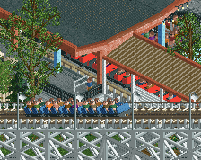
I really do enjoy the black and white colour scheme. Very atmospheric.
God I love this, it's just so SFNE / Six Flags America.
Thanks guys!
Outside of this entrance, the small bit of park I've made on this map doesn't really satisfy me. Not really confident I can pull off any sort of theming that would fit this park, but at this point I might start over and try something at SFNE/SFA or Knott's level of theming.
Trying to change up the atmosphere a bit from WoF and WW, hopefully this is enough of a change so it just does't feel like an extension to either of those parks.
Think this is pretty much the perfect screen. Only thing that bothers me are the red and blue tables, it's a good way to add some colour but it just doesn't work for me.
More flags, more fun. Words to live by really...
its really nice but i feel like ive seen this before.
You probably did, around 4 months ago
Only 18 comments on a G screen? C'mon ya'll we gotta hit 2 pages at least.