Screenshot / Syrvex - Launch to the Stars
-
 15-November 16
- Views 2,062
- Fans 0
- Comments 15
-
 Description
"The ancient civilisations knew more than we originally thought...
...Harness the power of the celestial bodies and prepare to launch to the stars on Syrvex - New for 2017"
I could do with some quick feedback on the layout, if you're interested in this please say and I'll send you a copy via PM.
Syrvex is inspired by the logo featured in the stock logo topic: www.nedesigns.com/topic/33405/logo-board/ -
 Full-Size
-
 No fans of this screenshot
-
 Tags
Tags
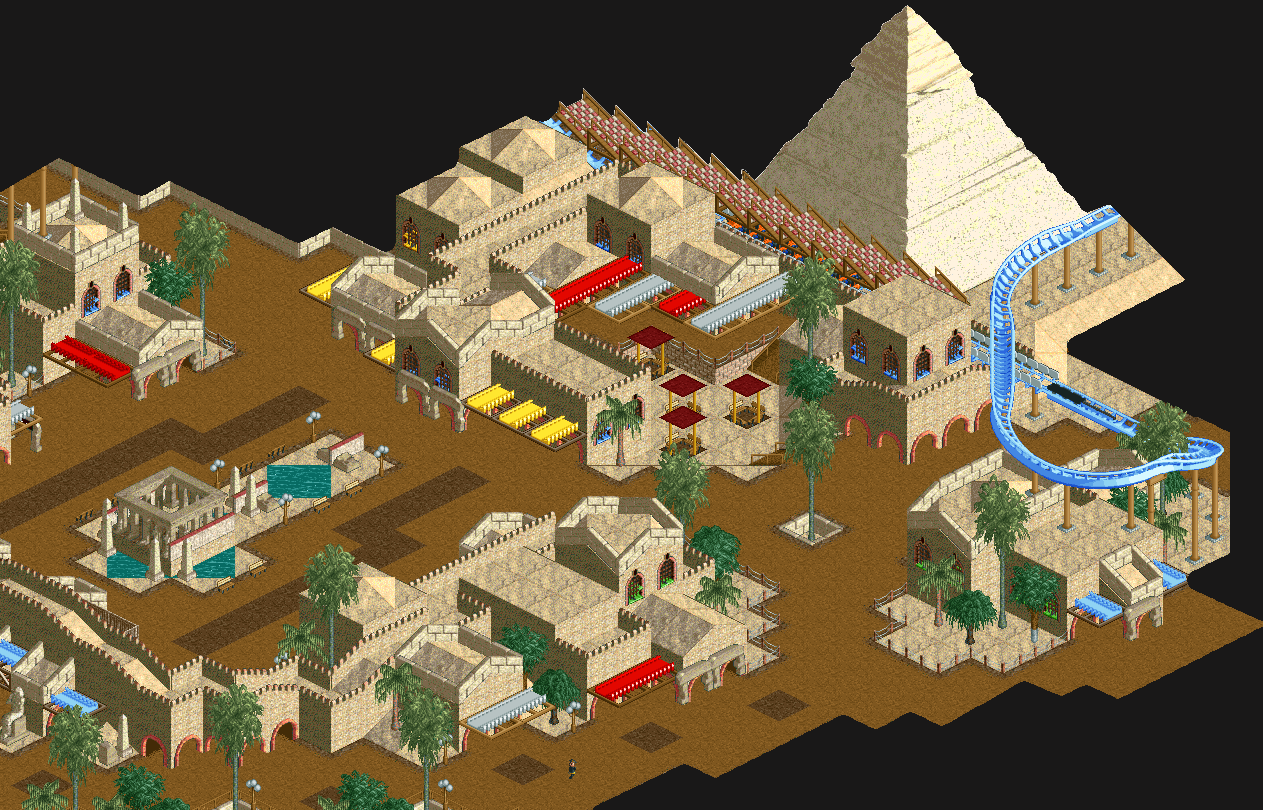
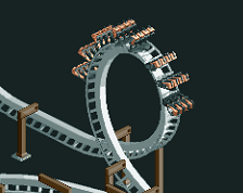
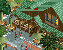
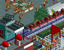
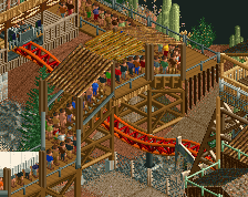
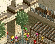
You seem a bit rusty, I like the screen but it's not as good as it could be. The colours and shapes seem thrown together; the awnings aren't working in all those different colours and the jagged path cover just seems completely random. Stick to red and white for awnings (great combo in this sandy context!) Remove the path cover. Refine the foliage (either the Fatha route (overly dense and chaotic) or with big features in sharply contrasting colours). Add some more features to the path. Find a more suitable spot for the seatings.
60%, good start
Yeah its all subject to change, at the moment in time I'm just throwing stuff down and then refining later. The awnings were originally just brown so I wanted to add some pops of colour, but then I added the colour to the windows and now its all a bit too colourful so it needs reworking, I thought the red and white was too sterotypical, I wanted to try and get things a bit more different, but I'll just stick to that.
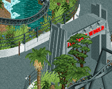
The jagged path is meant to be like a launch tunnel, its kind of lost in this screen, but the launch out in the open looks a bit too bland, I'll see what I can do with it.
Foliage is just all basic at the minute, it all is lol just putting stuff down, was just after some initial feedback, so thankyou
I agree with Liam, it feels a bit rusty. I wouldn't change anything yet, but once you're back in the grove more and are more confident in the vision for the park possibly come back and spice this area up a bit.
Sweet. Love the rough approach, and I do enjoy the geometries and shapes of your architecture. I also like the unconventional colours you've used.
Although, not a big fan of when trees cover up the windows + you need flowers, they make any LL work better.
Nice work louis. Keep going.
windows and awnings the same color as the coaster......bold
This reminds me of Gwazi's stuff. The 2x2 low buildings are very safe - interested to see if you can break out of that a little as you warm up to LL again.
I really like it. It's daringly simple and the composition is great.
I'm with alex here, the simplicity of this is very pleasant to look at. I like the buildings a lot, nice shapes. The path-roof-thing is a nice idea but could probably be developed further. Perhaps you should widen it some?
Thanks for all the comments guys helpful when just starting out again! first time i've played LL in years!
@intamin - there's 3x3 and 3x2 too
Updated Screen:
Took on board all comments.
-Changed colour of awnings.
-Finished up and altered the foliage.
-Cleared trees blocking windows.
-Added more things to the path.
-Removed launch tunnel.
Any better?
Beautiful!
Interesting stuff. It's certainly a break from the other styles commonly seen here. The completely sandy buildings work really well.
First screen was much better. Now you're just being colour insecure.
I really quite like this. It's nice how you're listening to what your feelings tell you as you build. The aesthetic as a result is innovative and the composition is great. It also has a very healthy low amount of hacking.
Just that brown path needs the yellow supports too on the tables. It currently has the wooden support.