Screenshot / King of the Sky, Queen of the Land
-
 07-November 16
-
 Monster Hunter Design Series
-

 2 of 4
- Views 1,924
- Fans 0
- Comments 3
-
 Description
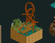
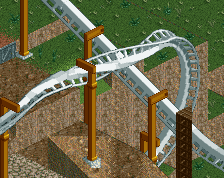
A dueler layout based off of Rathalos and Rathian, a "husband and wife" dragon duo. Looking for feedback, mostly on the end bit, before I begin work on the surroundings. I like the first half of the layout, but I want I need a little more focus on the names "King of the Sky" (red) and "Queen of the Land" (green)
-
 Full-Size
-
 No fans of this screenshot
-
 Tags
Tags
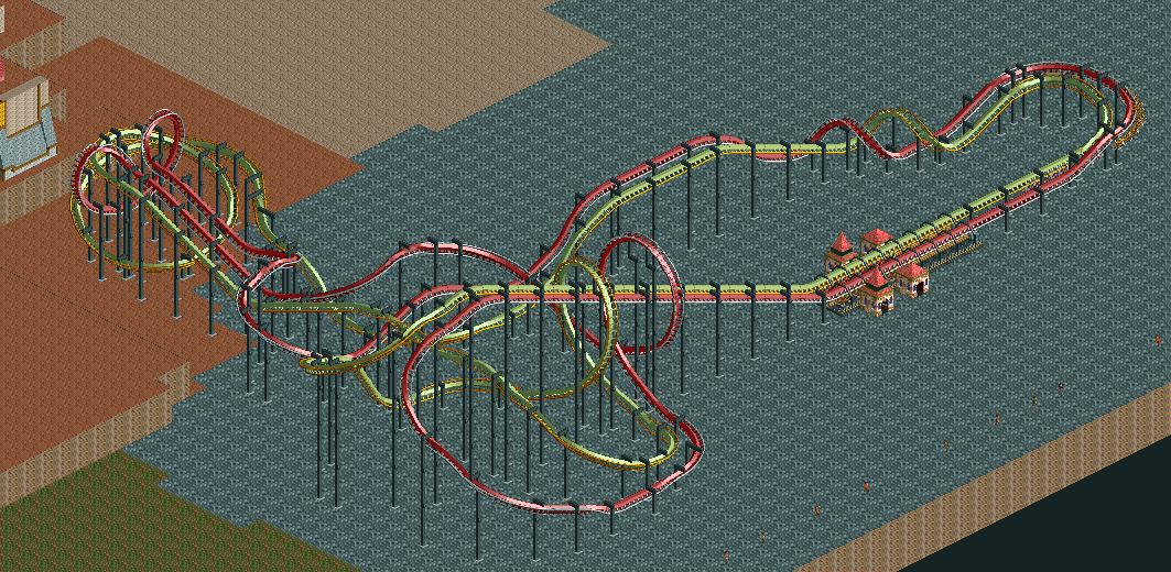
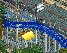
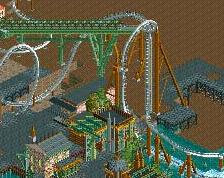
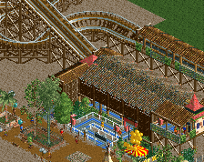
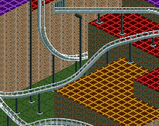
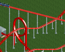
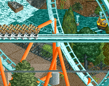
No point having an MCBR if the ride literally finishes after a corkscrew and a turn. Don't have the stations on ground level. The banked turn immediately after the loop on the green coaster looks way too sharp. The wraparound the batwing is nice.
I'm not a big fan to be honest. It seems like you had a few ideas for interactions (loopings, batwing, corkscrews) and just connected the dots with turns and things. As a result it looks really forced, lacking flow.
The concept behind the coasters has potential, but it doesn't translate into the layout. I would expect one of the coasters to be much lower than the other.
I gotta say I agree with Liam. Everything looks shoehorned together. The first drop on the red one has a wierd flattening out in the middle for example and the angular looking hill/drop before the batwing.