This is super good. The only thing I'm not certain about is the pink wood. The pink does not fit in with the rest of the screen's colour scheme... Maybe go with (roman?) fences there instead of the wood trick.
Also consider adding some western elements to the area. Signs of a culture centred around horses. Or donkeys. I don't know. Just an idea.
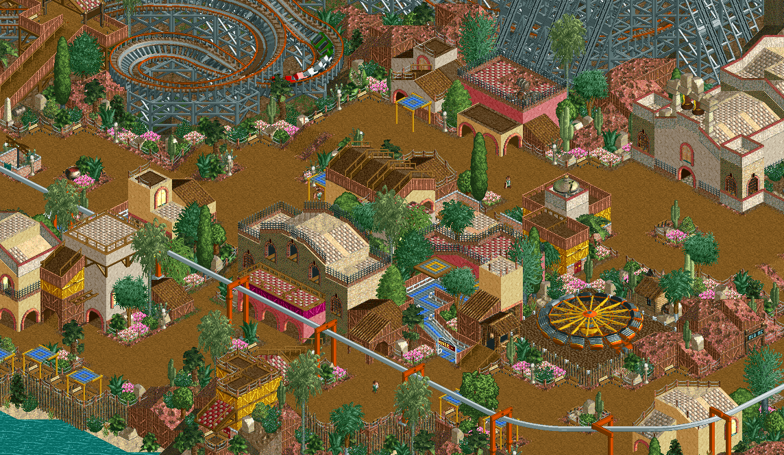
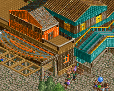
Its alright, but you've done much better. I'm not a real fan of the blobs of buildings and structures. Possibly forming streets or more linear arrangements of buildings would improve the area immensely.
This just feels like you rushed to finish it, which is probably true. Definitely lacks that edge and extra layer that the rest of the park has.
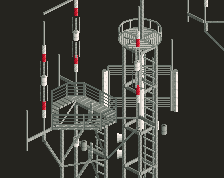
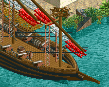
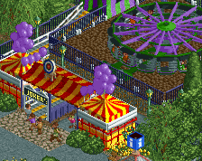
Love the queuing area for the enterprise.
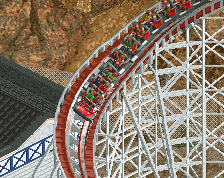
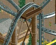
And I agree with the others, colours are great. However, I would experiment a bit with the colours of the wooden coaster. Grey is a bit distracting here, I think.
I can hardly add anything substantial to what's already been said, but I really like this and I'm really looking forward to seeing this finished. Probably my most anticipated RCT project since Luna Park.
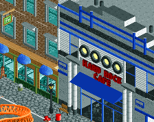
The colors here are very Cocoa, come to think of it.
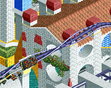
Since nobody has mentioned it yet, I'd like to bring some attention to the absolutely stellar representation of the curved mission church facade and bells.
 04-November 16
don't stay too long or you'll end up going loco down in acapulco
Beautiful atmosphere! Love the colors! Wow! Exclamation mark!
I love Hispanics!
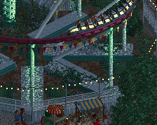
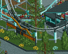
The colors are fantastic. I see the signature wooden colors are back, too.
This looks very warm and comfortable
I tend to overuse that dark orange everywhere I think.. not just on wooden coasters.
This is super good. The only thing I'm not certain about is the pink wood. The pink does not fit in with the rest of the screen's colour scheme... Maybe go with (roman?) fences there instead of the wood trick.
Also consider adding some western elements to the area. Signs of a culture centred around horses. Or donkeys. I don't know. Just an idea.
Its alright, but you've done much better. I'm not a real fan of the blobs of buildings and structures. Possibly forming streets or more linear arrangements of buildings would improve the area immensely.
This just feels like you rushed to finish it, which is probably true. Definitely lacks that edge and extra layer that the rest of the park has.
Love the queuing area for the enterprise.
And I agree with the others, colours are great. However, I would experiment a bit with the colours of the wooden coaster. Grey is a bit distracting here, I think.
I can hardly add anything substantial to what's already been said, but I really like this and I'm really looking forward to seeing this finished. Probably my most anticipated RCT project since Luna Park.
I really love this. I think I'm gonna have to play some LL to try out this colored wood trick...
The colors here are very Cocoa, come to think of it.
Since nobody has mentioned it yet, I'd like to bring some attention to the absolutely stellar representation of the curved mission church facade and bells.