Screenshot / Vienna Plaza
-
 29-October 16
-
 Stoksy's Europe
-

 2 of 4
- Views 2,279
- Fans 2
- Comments 9
-
 Description
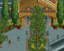
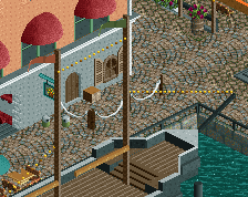
Main plaza structure
Yes, I understand people dislike the steel roof but texturally it best fit the real-life equivalent
Not really sure where this project is going, but I thought it'd be a shame not to release St. Charles' Church in some capacity so have come back to this "park" -
 Full-Size
-
2 fans
 Fans of this screenshot
-
 Tags
Tags
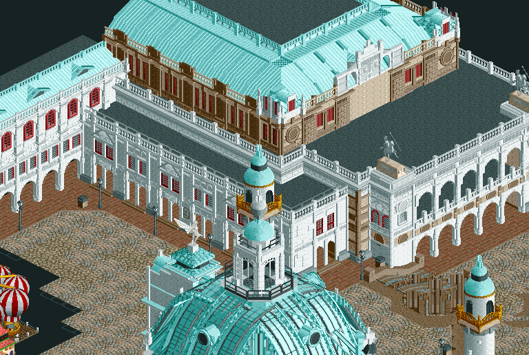
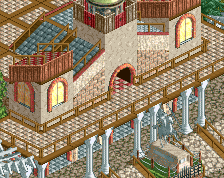
Perhaps try and minimize the amount of flat roof space. I feel it would look a lot better if the upper facade wasn't so far back.
You can probably use a completely different flat roof texture as well, especially in the 2nd level of the arched facade. Just try some different things, because I dont think this one is working.
Love it, great archy. Not a fan of the wooden coaster used as a stair.
Building is awesome, looks so great. But I agree with Fred, the coasterstairs just look messy.
Looks impressive. I don't mind the steel roof at all. Looks good. However, I'm not a big fan of that stair either.
I'm interested to see where this is going.
very beautiful, believable architecture
Simply wonderful! The trackitecture stairs aren't super pretty but they match the dome so I say keep them.
Issues have been fixed (bare roof + second level texture + trackitecture stairs)
Thanks all
Seriously impressive. Perhaps it's just because it's unfinished but it's lacking some signs of life - things to break up the uniformity a bit and add some contrasting colour.
Also.. maybe its too late to do something about it now but it really bugs me how the top of the dome and the corner minaret line up.
this looks amazing, just add some trees at the bottom to add some life?