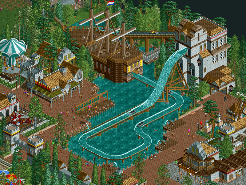
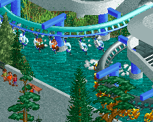
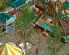
It looks nice, but I wonder how well it will fit into the rest of the park. Until now, everything you posted for this project has felt very much like its own thing.
Love the scenery boat. I quite like the merge being visible on the track- looks like a launch point for the ride boats somehow, as if they'd hang there for suspense then drop. Beautiful all round, and maybe not too much of an issue if it does not fit (G Force's point) the rest of the park, theme parks are something of a blank canvas as they can fit together in many ways, although I'd have to see it with the rest of the park to see where G Force is coming from (I can be wrong sometimes!) Great area.
Is this new? Looks to be. Not really feeling it to be quite honest. Wants to be too much, and isn't really. Very busy and "perfect", not effortless enough for this style.
@sneakyfrankie94: good suggestion, totally overlooked that possibility.
@G Force: I'm not entirely sure what you mean. Can you clarify?
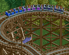
@mintliqueur: short indeed. Short but sweet. Most spillwaters are only a single drop. Oblivion is short. Main rides don't have to be long.
@posix: totally new! I totally see what you mean with it not being effortless enough. But that has kinda become this park for me. Started out as a typical Dutch timeline park, with rough edges and all. And now as the park's budget rises, the design is becoming more complex and refined, breaking away from classical Paulism. Although this stuff is definitely tied to Paulism again, unlike some of the previous big additions.
This is messing with my head a bit.. have you scaled this down image or is it just built to quite a small ingame? Something about it seems really miniature.
Probably scaled down a bit. OpenRCT makes it harder to frame screenshots in my opinion, I'm now used to having more stuff on my screen than usual and it's impossible to capture it in a single screenshot of a normal size. 800 x 600 is my preferred screenshot size, or at least 800 wide. That's why.
Probably scaled down a bit. OpenRCT makes it harder to frame screenshots in my opinion, I'm now used to having more stuff on my screen than usual and it's impossible to capture it in a single screenshot of a normal size. 800 x 600 is my preferred screenshot size, or at least 800 wide. That's why.
You can just crop your screens with paint or imgur. Since Open allows you to take screens in PNGs its easy to use paint or something like imgur to crop the image.
 29-October 16
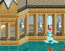
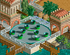


Cute
The water cannons are a lovely touch, as is the glass wall by the splashdown
atmosphere is on point
Beautiful.
maybe just use splash boat track at the top entering the drop, just to clean it up a bit and not show the merge. Other than that this looks great
So good.
It looks nice, but I wonder how well it will fit into the rest of the park. Until now, everything you posted for this project has felt very much like its own thing.
yeah I really like the whole composure of the area. really well thought out.
Love the scenery boat. I quite like the merge being visible on the track- looks like a launch point for the ride boats somehow, as if they'd hang there for suspense then drop. Beautiful all round, and maybe not too much of an issue if it does not fit (G Force's point) the rest of the park, theme parks are something of a blank canvas as they can fit together in many ways, although I'd have to see it with the rest of the park to see where G Force is coming from (I can be wrong sometimes!) Great area.
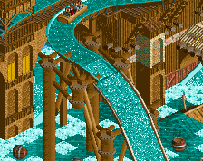
The tower is really, really good, but the ride itself seems oddly short?
Is this new? Looks to be. Not really feeling it to be quite honest. Wants to be too much, and isn't really. Very busy and "perfect", not effortless enough for this style.
Thanks guys!
@sneakyfrankie94: good suggestion, totally overlooked that possibility.
@G Force: I'm not entirely sure what you mean. Can you clarify?
@mintliqueur: short indeed. Short but sweet. Most spillwaters are only a single drop. Oblivion is short. Main rides don't have to be long.
@posix: totally new! I totally see what you mean with it not being effortless enough. But that has kinda become this park for me. Started out as a typical Dutch timeline park, with rough edges and all. And now as the park's budget rises, the design is becoming more complex and refined, breaking away from classical Paulism. Although this stuff is definitely tied to Paulism again, unlike some of the previous big additions.
This is a-god-damn-dorable.
This is messing with my head a bit.. have you scaled this down image or is it just built to quite a small ingame? Something about it seems really miniature.
Anyway, looks really nice.
Probably scaled down a bit. OpenRCT makes it harder to frame screenshots in my opinion, I'm now used to having more stuff on my screen than usual and it's impossible to capture it in a single screenshot of a normal size. 800 x 600 is my preferred screenshot size, or at least 800 wide. That's why.
I just image crop to show what I want to show, (not necessarily talking about NED uploads, as I only have 1 technical upload)
You can just crop your screens with paint or imgur. Since Open allows you to take screens in PNGs its easy to use paint or something like imgur to crop the image.