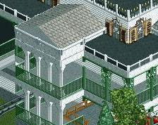
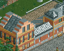
awesome architecture... just make sure it doesn't get too stale. it could really do with some life, or vibrancy, I'm not really sure. i would put merch racks inside the blue building, and even spilling out of the door into the street, with lots of pretty colors. or maybe tables with multicolored umbrellas, or just some different textures and contrasting colors on the buildings between deco pieces and wall textures. the chinese theatre looks great though!
There seems to be a flatness about those buildings... maybe more texture would help? The theater looks amazing! Those diagonals blend so well together and the detailing's perfect!
That Chinese theater is fantastic with the curved walls. The rest is very good but seems very single-color and thick. I would say this seems like a step back for you. I was hoping after Ruishi your next projects would be further into themes. That being said, i can't really complain about this either....
I think he'll do themes in this park for sure but honestly this is a main street and it's supposed to look a little unthemed I think, the themes come with the rides themselves and I can't wait to see you pull off some great movies in this park
I don't have too much time to get into it, but compared to other stuff from you, it's shit. I'd say its "over-detailed" but I don't consider random pieces glued onto the side of a building as detail. Those tiny deco 'sticks' are just too much. It doesn't look, I don't know... solid.
 31-October 13
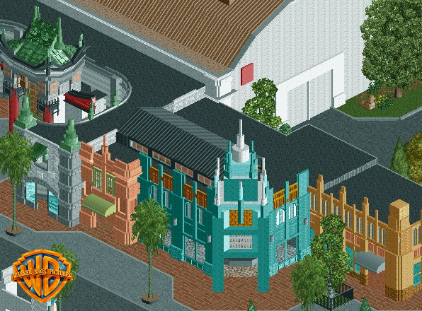
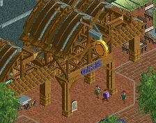
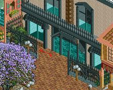
Love that Asian roof thing going on to the left!
awesome architecture... just make sure it doesn't get too stale. it could really do with some life, or vibrancy, I'm not really sure. i would put merch racks inside the blue building, and even spilling out of the door into the street, with lots of pretty colors. or maybe tables with multicolored umbrellas, or just some different textures and contrasting colors on the buildings between deco pieces and wall textures. the chinese theatre looks great though!
dont be afraid to vary colors, even on one building
that reminds me, things like posters, flowers, etc could really add life to it
I definitely needs more "pop"
told ya fixing the scale was the best idea
I agree with Cocoa. Looks amazing though.
There seems to be a flatness about those buildings... maybe more texture would help? The theater looks amazing! Those diagonals blend so well together and the detailing's perfect!
guess who's back, back again...
oh wait you never left...
Oh yes sir.
I'm sorry to say I don't like this screen much... I hoped for your next project to be something original.
All I see is nin bahahahaha
That Chinese theater is fantastic with the curved walls. The rest is very good but seems very single-color and thick. I would say this seems like a step back for you. I was hoping after Ruishi your next projects would be further into themes. That being said, i can't really complain about this either....
I think he'll do themes in this park for sure but honestly this is a main street and it's supposed to look a little unthemed I think, the themes come with the rides themselves and I can't wait to see you pull off some great movies in this park
RMM Offline
I don't have too much time to get into it, but compared to other stuff from you, it's shit. I'd say its "over-detailed" but I don't consider random pieces glued onto the side of a building as detail. Those tiny deco 'sticks' are just too much. It doesn't look, I don't know... solid.