Screenshot / #fbf - Voodoo
-
 29-October 16
-
 #fbf - Parks - G Force
-

 3 of 11
- Views 2,086
- Fans 1
- Comments 8
-
 Description
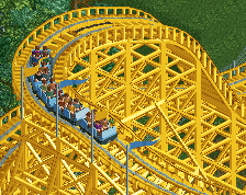
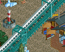
Despite it's simplicity, probably the best made coaster in the park. A late addition as well, much like Wizer, when I came around to the area there was some empty space and a last minute decision was made to add the coaster.
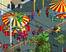
Pretty heavily inspired by Green Mamba at Starpointe, but I think an improvement all around. Plus, the location would be sick walking up to the entrance and looking up from the area around the double carousel. -
 Full-Size
-
1 fan
 Fans of this screenshot
-
 Tags
Tags
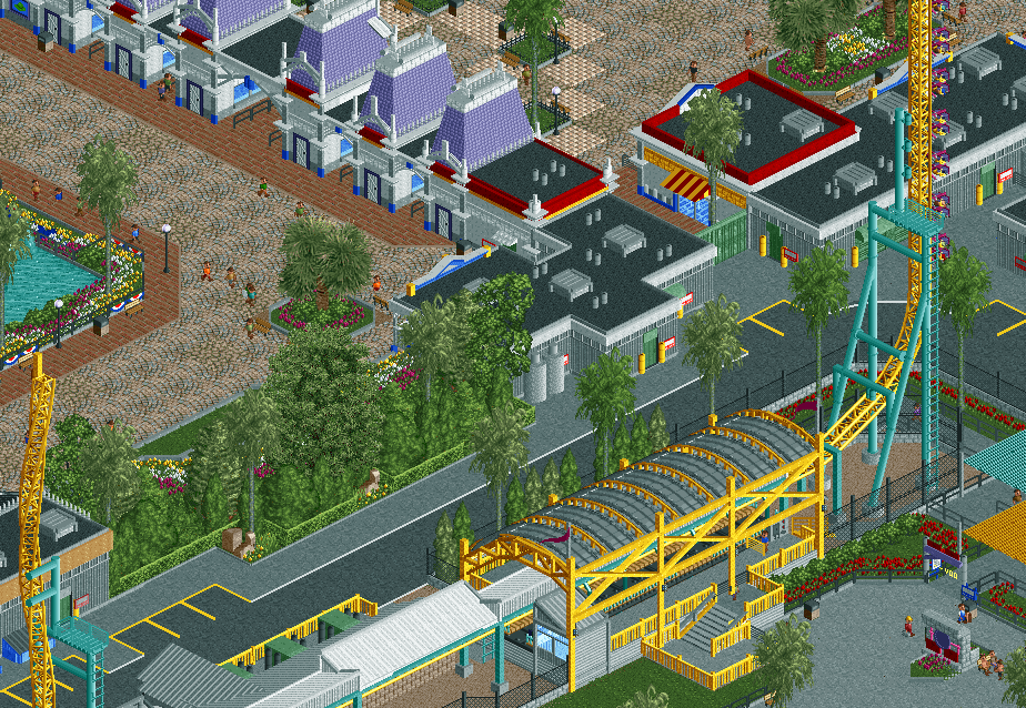
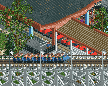
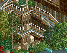
The station structure is gorgeous
that station is so clean and nice in it's realistic simplicity; the only complaint I have here is that some of the trees you've used like the 2x2 oak and the ones in the planters are a little off. The rest is just absolutely stunning
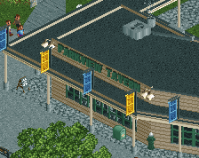
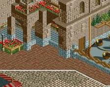
Really love the entrance area in this park.
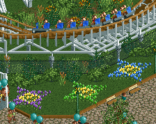
Whenever I need to look up how a certain type of ride has been done before in a realistic way in RCT, this is one of my main sources of inspiration. It truely is a benchmark for me, along with Starpointe and Thorpe Park.
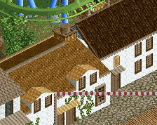
Hmm, yea the AC vent's are a bit out of control in this park. I kind of just placed them to take up roof space, without much logic other than space filling. Kind of had a similar problem in WoF too, but I think Bizarro is much better in this aspect.
Jappy, interesting you'd say that. I feel that the ride design is much better in WoF, although a bit more simplistic. But I can see that for the coasters here, mostly because its quite similar to Starpointe.
Wow, that's beautiful. I used to work at Dorney Park (as a lead for Thunderhawk) and this is spot on for Possessed.
Lovely