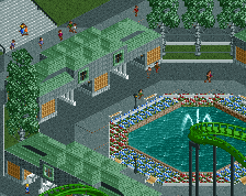
Screenshot / *Official* Emerald Gardens Entrance
-
 22-October 16
- Views 1,544
- Fans 0
- Comments 3
-
 Description
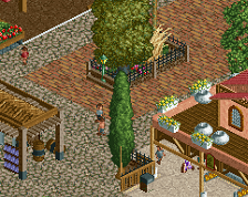
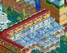
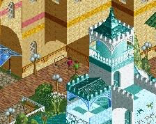
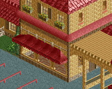
Completed The Official Logo, Scenario, and Entrance to my first NCSO/CSO, RollerCoaster Tycoon 2 Themepark.
I had to change my resolution for my laptop (Windows 10) to not get too hectic with a giant screenshot and resizing it on Paint because my photoshop trial expired, and my laptop is set to a higher resolution than normal RCT2's. Anyway, I took suggestions and help from people on the other two screenshots and came up with this for the official entrance for Emerald Gardens.
Share your thoughts! Thanks for the support!
- KB35
Shoutout to Admin Liampie! :)
*ALSO. I think the coding for the guests entering the map went crazy and the left side of the path before the entrance acted like a wall a few squares passed the fountain so I just set the guest spawn point to the far right path to make it easier on myself without having to re-design some of the path and etc.* -
 Full-Size
-
 No fans of this screenshot
-
 Tags
Tags
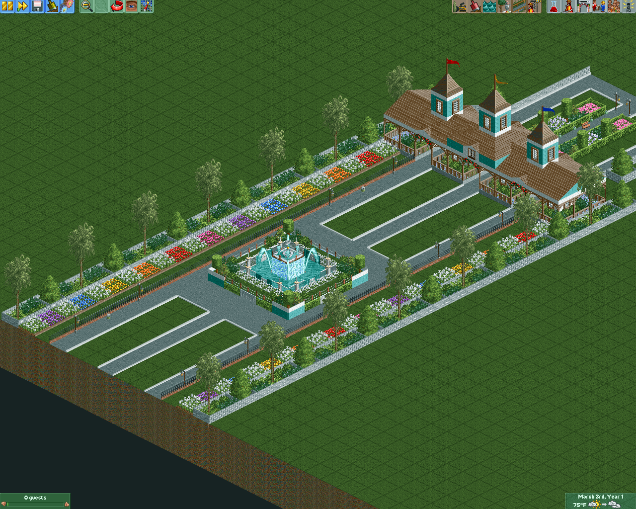


That's almost perfect now, I'd just change one thing- the green empty spaces work for breathing space (they may even be best left alone if this suggestion does not work) but they may be too empty- try out (after saving it as is first) some alternatives such as mown grass, a different land surface or just a couple of items to break up the emptiness.
It needs that breathing space though so if trying that ruins it just go back to how it is.
Others on here may have a better suggestion so any ideas?