Screenshot / Emerald Gardens Update!
-
 17-October 16
- Views 1,447
- Fans 0
- Comments 4
-
 Description
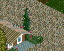
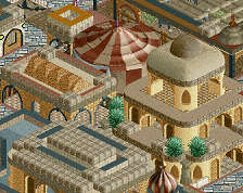
I have severe nerve damage in my right arm and I have to use my left hand for everything now for a while. Anyway I updated the park entrance to Emerald Gardens and decided to use all the colors since Im on pain killers and said why not. Hope you're looking for more updates and ill be as creative as I can while on these meds. Thanks Everyone.
*Also I need suggestions for the bare patches by the monorail and passed the fountains before the entrance to the park.* -
 Full-Size
-
 No fans of this screenshot
-
 Tags
Tags
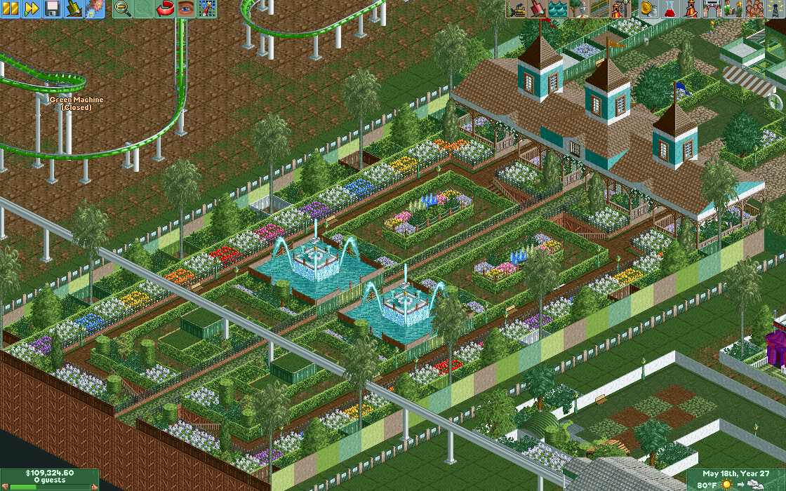
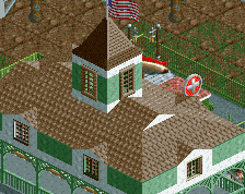

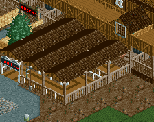
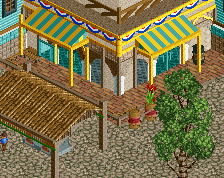
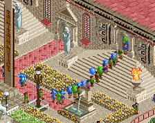
I adore the entrance building, but I'm not too sure if these pretty gardens in front of it are very efficient for an entrance, they don't allow for a lot of room for people to walk.
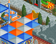
I think the general layout of the previous version was much better, but the added colour to the gardens definitely works better here, adds a lot of life. The building looks good, but I don't like the marble wall with different colours on the edge of the gardens. I'd hesitate to use that wall texture as a fence, but if you really want to, keep it a single colour.
I like the colours you picked for the flowers a lot. Stick with this colour scheme, it works excellently.
Kosherboy35 Offline
Cool ty so much guys ill edit it and upload another screenshot