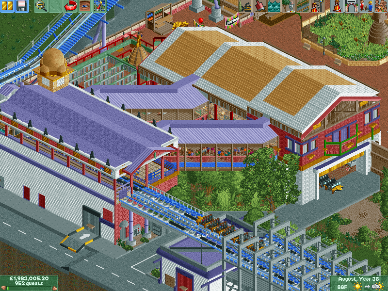
I think the rooves are bringing it down a little bit. The tan and white roof feels assymetric (in a bad way) and really overbearing- it ruins the nepalese feel of the facade. I didn't even realize it wasn't just a 'generic' theme at first. Also the purple diagonal rooves could be fine but the ones used on the station itself don't work. Once again takes away from the tone of the buildings and there's overall too many roof textures to really makes sense of anything. otherwise I think it could be good but I'd love a bit more dense, sort of thick/tall indian foliage to sort of highlight the buildings.
to improve the rooves, I reckon I'd ditch the staggered one on the tan building, and maybe make the farther roof (with the solid wall) maybe a story taller. Then one of the rooves can have a sort of more ornate Asian sloped roof style and the others can be flat and complimented by the sort of nepalese siding you've done really well (especially on the station). And for the station, I'd make it not purple (so the diagonal bridges stand out more)
thats just my opinion though, feel free to do whatever the fuck you want
I've been smashin out a load of rct2 lately for you lucky people! and I've started on shambhala itself. Check out its station and que. Moving onto the restaurant and water splash area but got a bit of work and social coming up.
other angle
I was going to say the same thing. Its nice though, not a big fan of the slanted roof textures, but that's probably a minor thing.
Not really much else to say, everything looks pretty solid.
I think the rooves are bringing it down a little bit. The tan and white roof feels assymetric (in a bad way) and really overbearing- it ruins the nepalese feel of the facade. I didn't even realize it wasn't just a 'generic' theme at first. Also the purple diagonal rooves could be fine but the ones used on the station itself don't work. Once again takes away from the tone of the buildings and there's overall too many roof textures to really makes sense of anything. otherwise I think it could be good but I'd love a bit more dense, sort of thick/tall indian foliage to sort of highlight the buildings.
to improve the rooves, I reckon I'd ditch the staggered one on the tan building, and maybe make the farther roof (with the solid wall) maybe a story taller. Then one of the rooves can have a sort of more ornate Asian sloped roof style and the others can be flat and complimented by the sort of nepalese siding you've done really well (especially on the station). And for the station, I'd make it not purple (so the diagonal bridges stand out more)
thats just my opinion though, feel free to do whatever the fuck you want
this looks excellent. keep it up