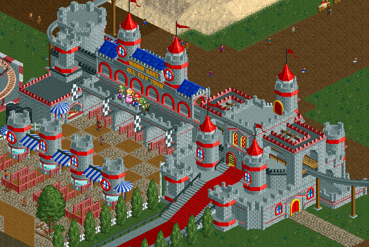
Screenshot / Mario Kart: All Cup Tour Entrance
-
 08-October 16
-
 Mario Kart: All Cup Tour
-
 1 of 15
- Views 4,208
- Fans 7
- Comments 21
-
 Description
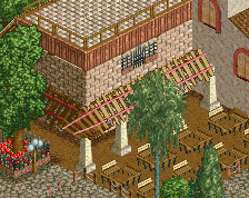
First screen of one of my newest parks. A full fledged Mario Kart: All Cup Tour park.
Obviously unfinished, but I'm looking for some opinions on whether to go with the brighter colors or more muted colors on the entrance, since color isn't my strong suit. Considering it's based on a video game, personally I think that brighter is better. What's your thoughts? Any adjustments to make? -
 Full-Size
-
7 fans
 Fans of this screenshot
-
 Tags
Tags
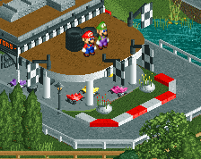
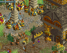
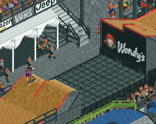
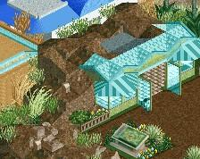
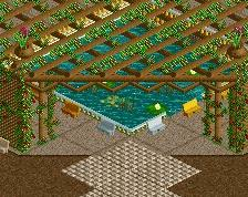
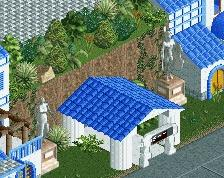
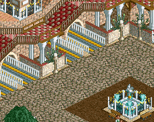
Here's the muted colors version of the entrance...
Attached Thumbnails
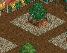
edit: Stick with the same path textures before and after the entrance building. I don't think the brown looks good there anyway. Light is the way to go. I personally like the blue roofs too, unlike Faas, but possibly there are other colours that look good.
Liam, I assumed you're referring to the dark brown inside the park? I'll keep that in mind. What about the light brown mixed in at the entrance and ticket booths?
As for the dark blue, this is Mario's Castle, so the colors are based on him, which is bold red, dark blue with touches of white and yellow. So I'll probably stick with the darker blue otherwise I'm breaking away from the theme.
Fantastic. The first screen is brighter which feels more mariokart than those dull colours. As a competetive mariokart player i'm super excited to see more of this!
So excited! Bright version is definitely way better.
It's quite good though, I'm interested to see what you can do with the theme.
Thanks for the comments guys, glad you like it! I'll post more soon.
Awesome! There should be more videogame related park projects!
Please do DK mountain!!
This looks great, a lot more refined than your previous work but just as interesting. Looking forward to seeing more!
@Goliath123 - Hell yeah, it's definitely in the works. Not sure how to build the cannon yet, still trying to figure that one out.
Yeah. I know its been a while since i`ve been around but thismade me come out of hiding.
I'll be watching this for sure
-Josh
Wow! So good. I love it! Can't wait to see more.
Anyone want to help me out with making/changing a few objects for this project? If so, please PM me and I'll give you more details.
looking forward to this!