Screenshot / Ancestral Steppe
-
 07-October 16
-
 Monster Hunter Design Series
-
 1 of 4
- Views 2,678
- Fans 0
- Comments 13
-
 Description
I've finally been able to get back into RCT enough after my post-NEO rut/Monster Hunter addiction with a new project: a Monster Hunter-themed park because I'm still addicted! My LL design is currently on hold awaiting further inspiration.
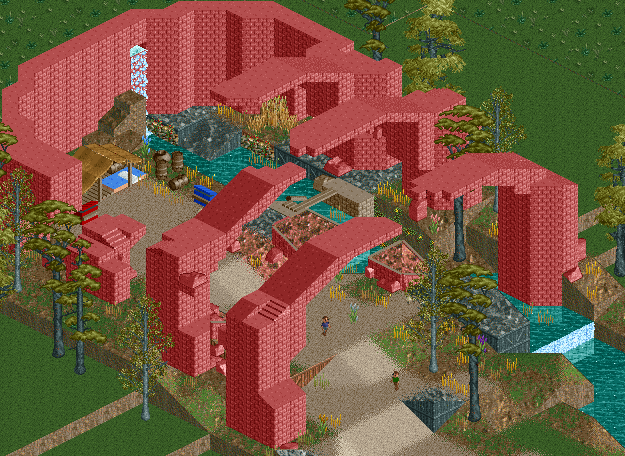
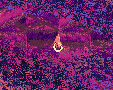
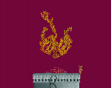
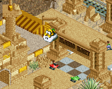
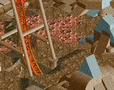
This is the entrance area, the base camp from the Ancestral Steppe in MH4U, with guests emerging from the tent to begin their quest through the park. I'm looking for advice on the ruins, to add a little substance to the textures to make them seem more ancient and decrepit. I'm still figuring out the surrounding foliage but I would love some feedback on the ruins area. -
 Full-Size
-
 No fans of this screenshot
-
 Tags
Tags
Add some non-brick texture to those broken arches and this'll be pretty good
I was going to say the same thing as Stoksy.
Maybe add some texture to the top of the brick structures as well, the "roof texture" or something like that would work well.
No, just anywhere on the arches replace some of the brick with some other textures. If you look at a real ruined brick wall, say in Athens Greece, its not a clean brick texture like you have, its more muttled and mixed with other materials.
I'm a little late with this, but does this look any better? Not sure that the slanted roofs look quite right. Also is there a quarter tile piece for the flat roof texture?
Definitely better! I'd maybe change the top of those thin brick pieces from brown to just the red you've been using. Perhaps a few more pieces of texture and 1k ruins as well to sell the ruined nature a bit more.
Nice work!
Nice improvement.
I love it - you sell the ruined part well, the river is awesome, the camp is really nicely detailed. I just don't know if red is the right color here. I get what you're going for, but the shades of red in RCT aren't really good at conveying a good subtle palette - we have lots of shades of green and a couple blue/purples, but really bad diversity in reds, oranges, yellows - there are only like 3 usable reds. I feel like the light brown might work a bit better
How are those arches staying up? i suppose if its built by the park with steel inside or made of light material it would add a lot of tension to worry that the bricks were going to fall on you
Much better improvement, I do wonder how this will fit in with the surroundings though.
The area it's based off the ruins are close to this shade of red. A lot of red and yellow which I understand makes it difficult but the colors are pretty important I think to the area.
@SSSammy
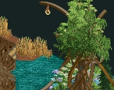
I had that thought too, i might have to reshape the arches a bit or reinforce them where they connect to the pillars. See the pic below
@Louis!
Unfortunately since the map isn't open world but area based, there's no view from outside of this structure. I'll have to fill in the blanks based on how the rest of the map generally looks.
http://vignette3.wik...=20120906163110