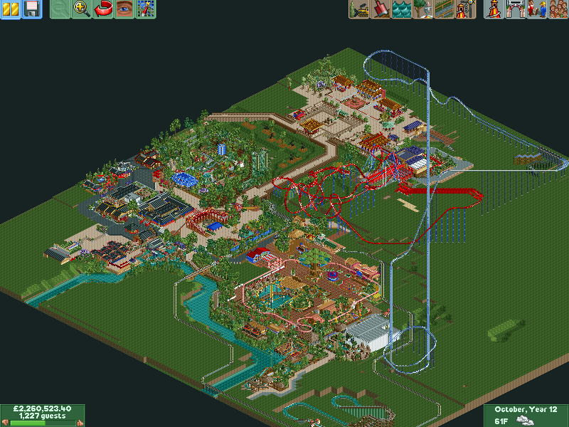
@G Force the trees on the other side are in a western area but I could blend a bit better. Got Shambhala, a rapids and splashboat and a few other buildings, getting there.
I might suggest modifying the Shambhala layout so there are less diagonal hills. Give it more of a L shape layout than a triangle shape like you have now.
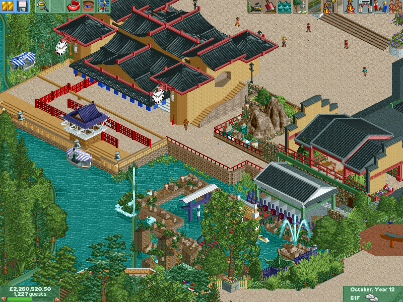
Holy diagonals, Batman. I was going to first comment that I really like the first screens posted, outside of them looking just a little barren with nothing on the paths. More peeps and benches and shit would help a lot. The boat in the grass is a nice touch, and the little rock fountain thing is great too.
Everything looks great except for the coasters. The diagonals aren't even the worst, Dragon Khan's first drop and the bend that follows worries me a lot more. The scale is off almost everywhere...
I agree with Liampie, maybe take a bit more artistical freedom and tweak the layouts a bit to something that looks good. Otherwise I'm afraid the layouts might ruin a great park.
Crap. Wrong screen! comment on this one!
another angle
@G Force the trees on the other side are in a western area but I could blend a bit better. Got Shambhala, a rapids and splashboat and a few other buildings, getting there.

I might suggest modifying the Shambhala layout so there are less diagonal hills. Give it more of a L shape layout than a triangle shape like you have now.
That diagonal tho. Wow.
But the theming looks marvelous at least.
I agree with Liampie, maybe take a bit more artistical freedom and tweak the layouts a bit to something that looks good. Otherwise I'm afraid the layouts might ruin a great park.