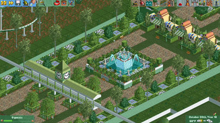
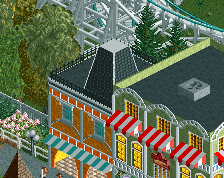
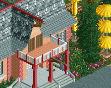
I actually like this. Its just very simple, you have lots of room to add stuff. For example where do you buy tickets. Its a okay feel right now, but another colour in there probably wouldnt hurt. It has a classic feel
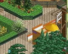
It's pretty and aesthetically pleasing, but there's so much green. maybe green roofing isn't the best idea. and as far as the park entrance goes, I'd probably make my own ontop of an invisible one rather than use the default wonderland entrance
Thanks Guys! the park is dedicated to Mother Earth and I have Mainly green and brown as the colors. Ill be making a Blue/purple, Red/orange, and Yellow/mixed colored Parks as well. Just random ideas thank you all for being honest and helpful!
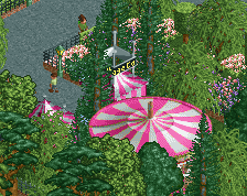
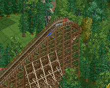
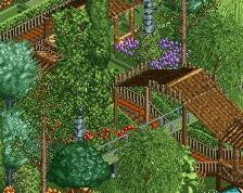
The lots of green approach could actually work really well if you make the park about blending things into the landscape. I actually really like the idea - have used it myself in places in the past.
The beauty of it if you get it right is it's like a forest - the colours are repeated but with subtle variations and an overall harmony that results out of the limited palette where everything works as one entity.
Not easy because you need to find how to get the harmony without being too samey and finding where it needs breaking up, get it wrong and it could be boring, but don't be afraid to start with the limited natural colours first then change things later if needs be.
The white works well here for breaking up the green, the entrances maybe clash a bit but I think I still like them, perhaps worth keeping. I'd lose the big, plain green walls down the sides though as they do not look right somehow..
Looking forward to seeing more. I've capped the rating as it's part of a project, on a standalone basis it's better than that.
My first Theme Park using custom scenery and ACTUALLY GOING TO FINISH. Lol. Hope anyone who is interested will want me to upload a download link once it's finished. Yes the park is supposed to be mainly green. Dedicated to Mother Earth.
 05-October 16
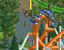
I actually like this. Its just very simple, you have lots of room to add stuff. For example where do you buy tickets. Its a okay feel right now, but another colour in there probably wouldnt hurt. It has a classic feel
It's pretty and aesthetically pleasing, but there's so much green. maybe green roofing isn't the best idea. and as far as the park entrance goes, I'd probably make my own ontop of an invisible one rather than use the default wonderland entrance
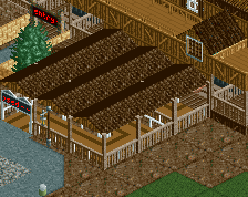
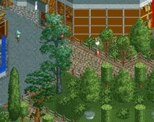
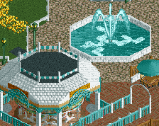
I'm a large fan of NCSO, so the screen pleasing to the eye, but it's just so close.
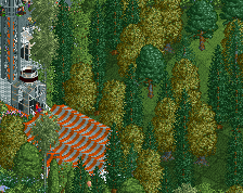
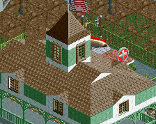
Probably would look better without the green path, blends in a bit too much with the surroundings for my taste.
Thanks Guys! the park is dedicated to Mother Earth and I have Mainly green and brown as the colors. Ill be making a Blue/purple, Red/orange, and Yellow/mixed colored Parks as well. Just random ideas thank you all for being honest and helpful!
The lots of green approach could actually work really well if you make the park about blending things into the landscape. I actually really like the idea - have used it myself in places in the past.
The beauty of it if you get it right is it's like a forest - the colours are repeated but with subtle variations and an overall harmony that results out of the limited palette where everything works as one entity.
Not easy because you need to find how to get the harmony without being too samey and finding where it needs breaking up, get it wrong and it could be boring, but don't be afraid to start with the limited natural colours first then change things later if needs be.
The white works well here for breaking up the green, the entrances maybe clash a bit but I think I still like them, perhaps worth keeping. I'd lose the big, plain green walls down the sides though as they do not look right somehow..
Looking forward to seeing more. I've capped the rating as it's part of a project, on a standalone basis it's better than that.