Screenshot / Spacetopia Entrance
-
 03-October 16
-
 Spacetopia
-

 7 of 15
- Views 2,387
- Fans 1
- Comments 13
-
 Description
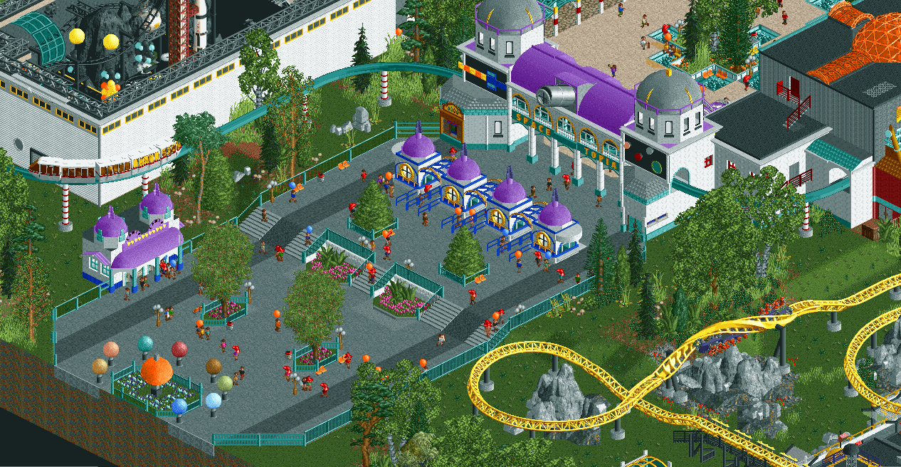
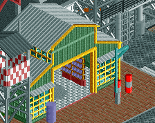
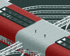
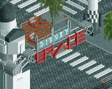
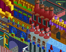
The first stuff you'll see when entering the park.
How far along I am with this park (areas aren't definite):
Entrance area: 99%
Lunar Lands: 95%
Comet Craters: 25%
Little Aliens area: 20%
Wild, Wild Mars: 10%
NASA Neighbourhood: 5%
Kosmonaut Korner: 0% -
 Full-Size
-
1 fan
 Fans of this screenshot
-
 Tags
Tags
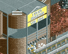
Kind of feel like your building the same park as always, just re-dressded with a space theme.
Not to say its bad or anything, I quite like it. But it feels exactly like all your other entrances apart from the space theme.
Love this project. Can't wait to see how it all comes together.
It looks like you have a lot of fun building this. The monorail station is amazing.
Sort of underwhleming, but very faas.
Very nice, but I can see where G Force is coming from. A little extra surroundings wouldn't hurt. Nonetheless, keep doing what you're doing, you are brilliant at it. Your style in instantly recognisable and feels so alive.
This is what RCT2 is meant to be like, wonderful stuff Faas
I think the building without any context (before the actual entrance) doesn't fit at all. Were you to take the 'context' approach then it might work better, but with just green grass and some foliage patches the architecture doesn't work as well. Individually it's good, but really going all out with the space themepark would make it even better.
Love the interior on the left.
i think it looks fantastic. Love the monorail supports.
I somewhat agree with G Force that it's unimaginative and lacking depth. And at that, it's not quite pretty enough to sell it.
I like it a lot. G Force has a point indeed but I don't think you're going for something very realistic or super original, it's very Faas so that's enough for me.
Interesting
Great work, I always enjoy your parks, not much to nit-pick about, other than if you build faster than we can enjoy this release sooner! Give the people want they want!
gorgeous