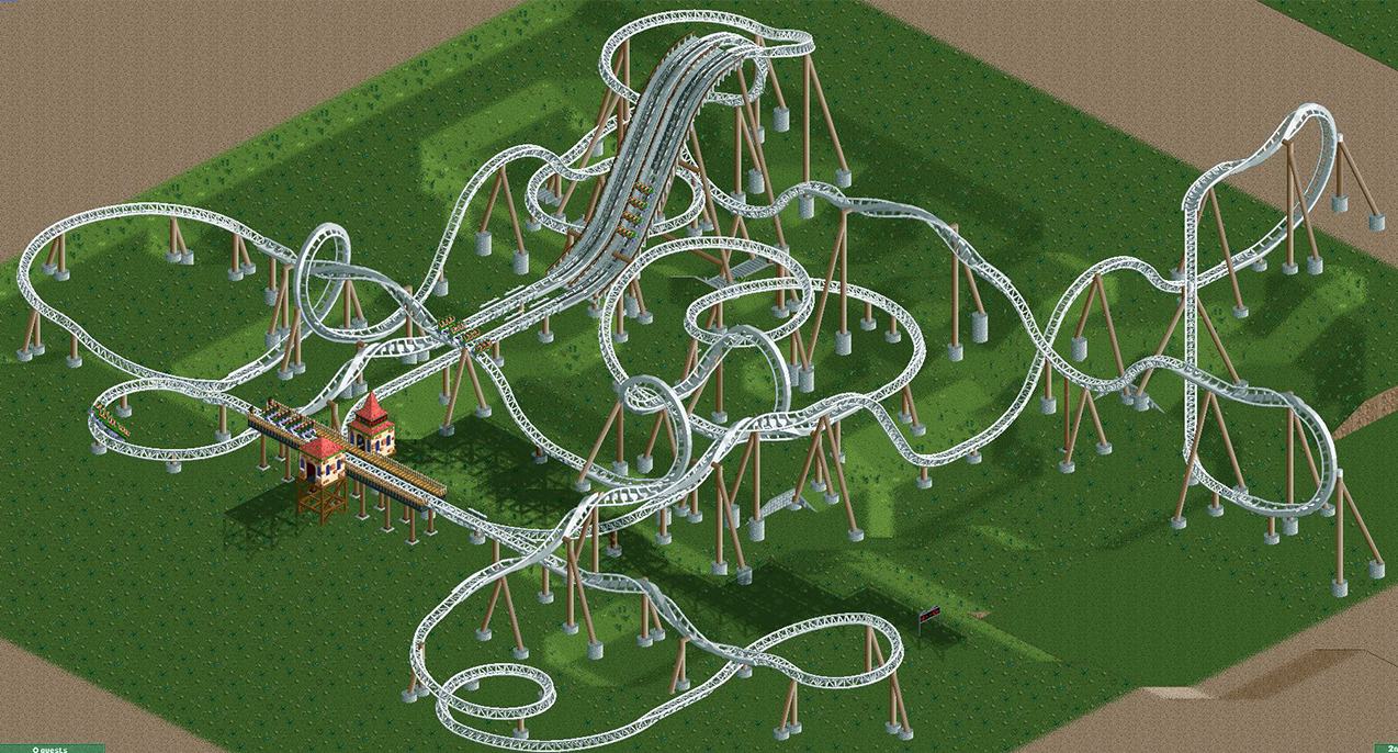
Screenshot / Echo Layout
-
 24-September 16
- Views 1,922
- Fans 0
- Comments 7
-
 Description
Hi chaps!
Just wondering what you guys think about the layout for this ride. Inspired on the Smiler at Alton Towers and JimmyLaessig's screenshot.(http://www.nedesigns.com/screenshot/892/illusion/).
Went for something different in the end, but i'm happy with the layout overall. -
 Full-Size
-
 No fans of this screenshot
-
 Tags
Tags
Very cool that its not nearly a smiler lookalike and more spread out.
The rating also!
Attached Thumbnails
This is really neat! I'm very interested in how you're going to integrate path interaction. I also think that you could tighten it up in certain areas though however, where you have the large turns, I think you could use the smaller banked turns. This will make it flow a little better
Same! Got a few ideas...
Looks good, I like the parallell lifts. A little overkill on the barrell rolls maybe but I suppose it's realistic given the type of coaster. Looking forward to see this themed and finished!
Other than the double-barrel maybe being overkill, my only complaint is the tight turn after the first lift+drop.
I feel like it could be a bit more compact and convoluted, but that is probably hard to achieve in RCT. Right now the whole layout is on a good way, but it feels a bit too angular. Maybe a fe more diagonals would help.