I really love that you themed the star flyer like that, very cool. Excitced to see the release.
I can understand the theme of it.
Its lovely work.
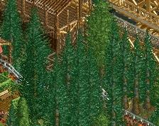
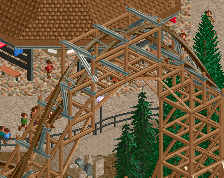
I think some of the foliage could do with being cut down, not so bushy and wild all over.
Apart from that, its very good work!
This makes me feel like I am playing the Witcher 3 in Skellige
The sunflower things are no good, the grey rocks are jarring they should be black. I disagree with Liam, I think the cliff is really good. Beautiful work, these are just nitpicks
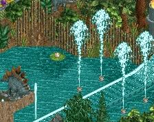
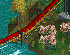
love the foilage. don't understand the connection between the lighthouse and norse mytholog though.
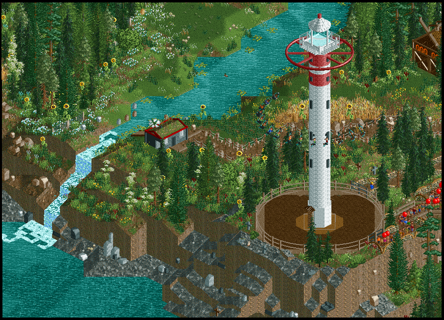
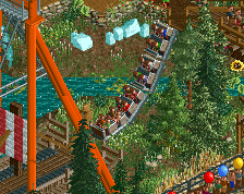
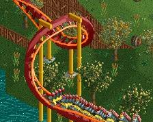
Njörðr, the Norse God of Wind, swings by the cliffs of the fjord as one lone farm house sits looking out over the ocean. This screenshot marks the submission of my B&M Dive Machine design, Jötunn. Hope you all enjoy -- Kieran AK, Goliath123
 18-September 16
I really love that you themed the star flyer like that, very cool.
Excitced to see the release.
The cliff needs some smoothening.
I can understand the theme of it.
Its lovely work.
I think some of the foliage could do with being cut down, not so bushy and wild all over.
Apart from that, its very good work!
This makes me feel like I am playing the Witcher 3 in Skellige
The sunflower things are no good, the grey rocks are jarring they should be black. I disagree with Liam, I think the cliff is really good. Beautiful work, these are just nitpicks
love the foilage. don't understand the connection between the lighthouse and norse mytholog though.