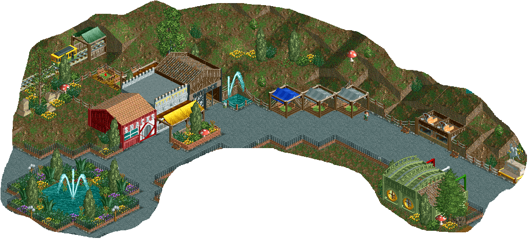
Screenshot / year 64 teaser + layout
-
 13-September 16
-
 small ncso park / name undecided
-

 5 of 5
- Views 1,823
- Fans 0
- Comments 8
-
 Description
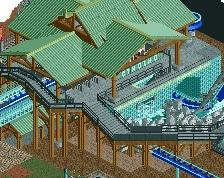
After getting a new computer, I took an involuntary leave of RCT for a while. Now I'm back with a traditionally unfinished picture that I am really divided on, and 64 in-game years have gone by with me just redoing the buildings and the layout here. Any advice?
-
 Full-Size
-
 No fans of this screenshot
-
 Tags
Tags
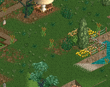
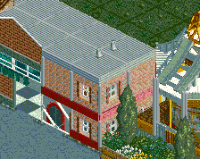
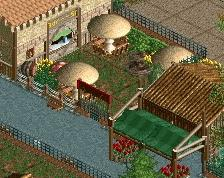
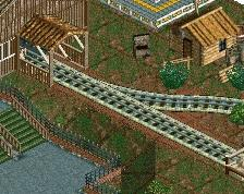
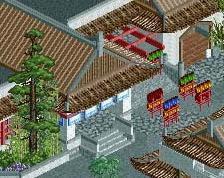
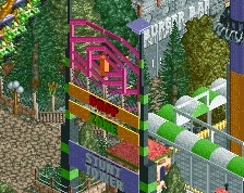
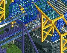
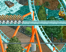
Proud of that pizza stall; also, need advice for that b&m hyper layout (not the best at layouts, unfortunately)
Attached Thumbnails
If you're going for realism, it's not the most realistic of hyper layouts, but otherwise I think it's unique. Maybe take a look at other hypers on this site to get some inspiration if you don't feel satisfied, but I think it's pretty solid.
as for the scenery, that's some good quality, small-town ncso. looking forward to this
The buildings look nice, a freshish take on NCSO.
Small buildings! Yeeey! Great stuff and a bit different from what the usual NCSO we see on this site. Looking forward to more.
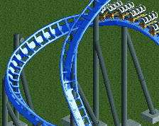
what do you think of these different turnarounds?
Personally I like the first one. But I think it's the ending that needs more work before the final brake run. Look up the new hyper Mako in Sea World for inspiration.
Second one looks best to me. The in game helix pieces never seem that realistic to me on B&M hypers. Plus the second done flows a bit more from the angle you posted.
#2